

Bidó Montero C.C.
We built the brand, the logo and the market research for a construction company that needed an identity of its own in a saturated market.
 Brand Book · Logo Design · Research · Aug 2023 – Oct 2023
The project
Bidó Montero C.C.
Bidó Montero builds, sells, remodels, maintains and leases real estate. But it arrived with a challenge ahead: an identity of its own in an already saturated market.
In construction, image decides. A distinctive brand isn't decoration — it separates the firms that win contracts from the ones that go unnoticed. Bidó Montero came to Zagirova to build that brand.
The industry is competitive, and the firm was a newcomer. There was no room to wait. The identity had to establish presence from day one.

The challenge
Standing out in a saturated industry
The brief was demanding: build an identity capable of condensing Bidó Montero's approach, its commitment to the client and its experience in the local real estate market.
Being recognized wasn't enough. The brand had to inspire trust and communicate the firm's values. That meant knowing the company, the industry and the market dynamics inside out.
A difficult task, yes. The kind that pushes the craft to its limit so a construction company can stand out in a crowded field.
Research & insight · Web analysis
Market and competitor analysis
Before the first sketch, we researched. It was the decisive step: without it, the identity wouldn't resonate in the market, wouldn't stand apart from the competition, and wouldn't attract clients — current or future.
We studied the construction industry in depth, mapped the competition and learned what prospective clients look for. The question was a single one: how could Bidó Montero set itself apart and become attractive to its audience.
This wasn't collecting data for its own sake. It was extracting the judgment that would guide an identity true to Bidó Montero's approach, its commitment to the client and its experience in the local real estate market.

Branding · Logo design
From research to sketch
With the research in hand, we began drawing the logo. Each proposal incorporates the key elements the previous phase revealed. These are the directions we put on the table for Bidó Montero:
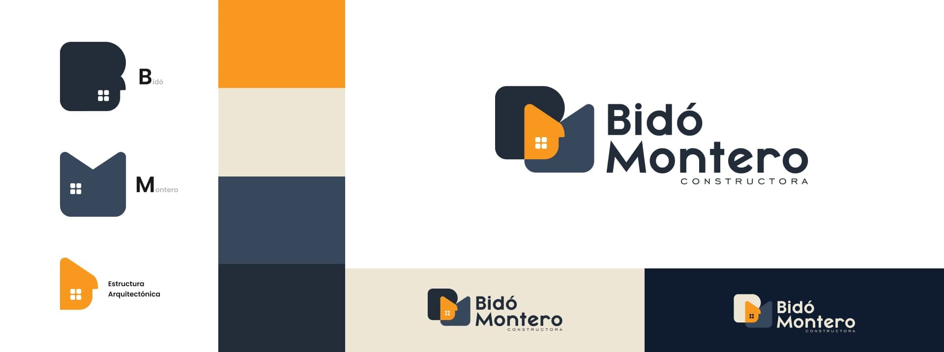
Proposal no. 1
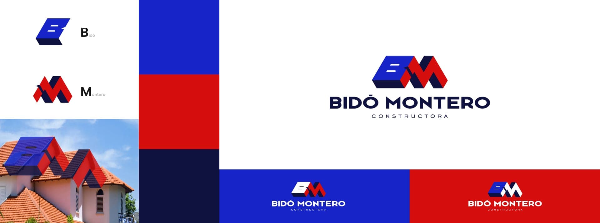
Proposal no. 2
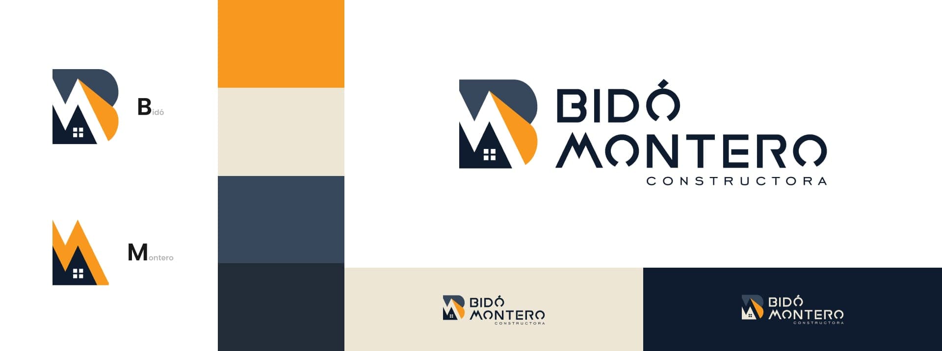
Proposal no. 3
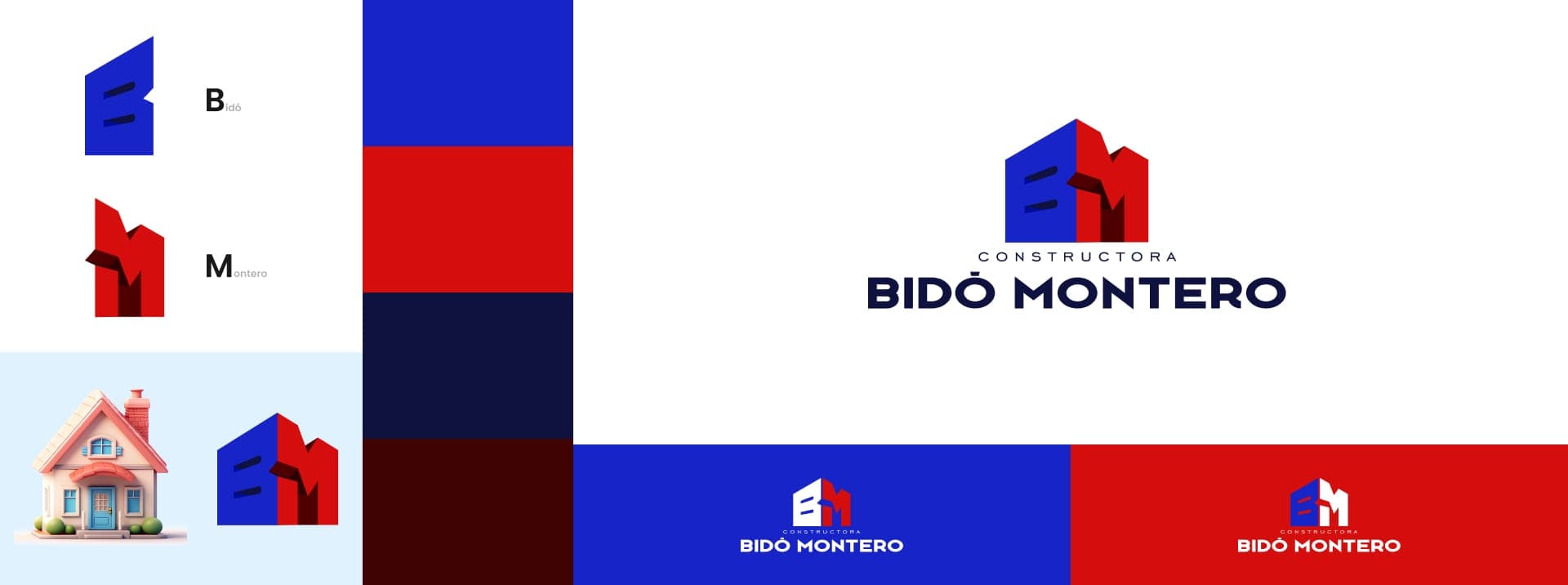
Proposal no. 4
Branding
Choosing the logo
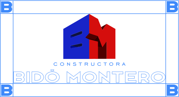
With the proposals and their color variations presented, the client chose one — and added an idea: incorporating the palette of one of their neighboring businesses.
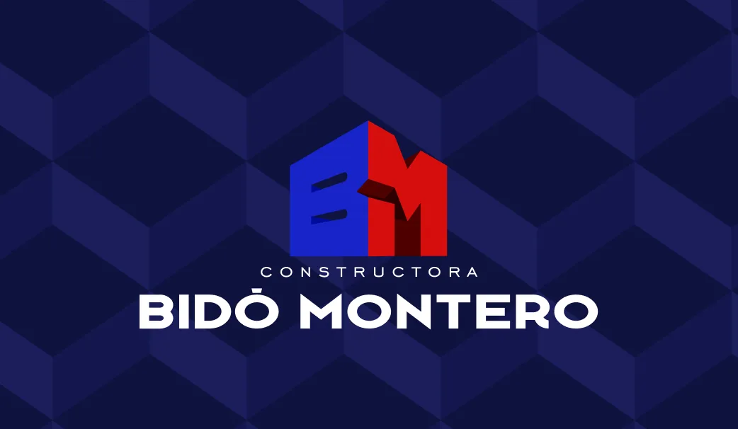
A decision with sound judgment behind it. It keeps the client's several companies coherent. The final logo asserts Bidó Montero's singularity while tying it to the rest of the client's businesses.
Branding
Typeface selection
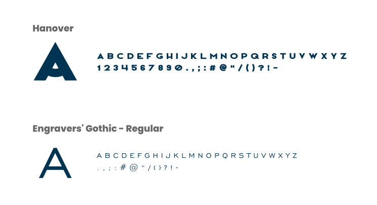
Hanover and Engravers' Gothic. Two typefaces that follow the geometry of the logo and read clearly on any medium, print or digital.
Branding
Color selection
Red and blue. Two colors that say exactly what a construction company is.
Red is strength and determination: the solidity of what the firm builds. Blue is trust and reliability: the promise of delivering on time, with quality.

Branding
Texture
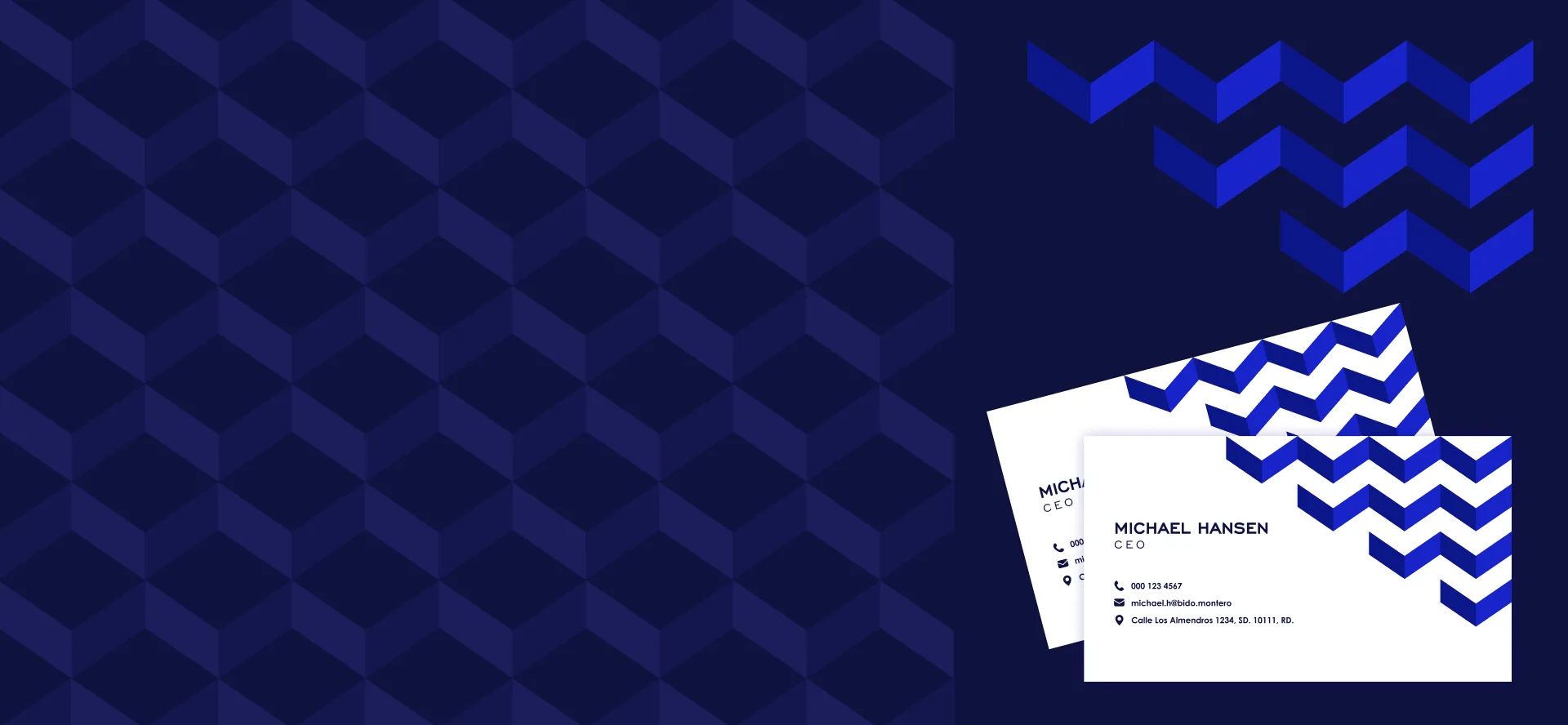
We built a texture of Bidó Montero's own, derived from its geometric logo. It isn't ornament: it adds depth, creates visual interest and reinforces the brand.
Across every medium, the brand experience stays uniform. The geometric texture is a constant reminder — subtle and firm — of the solidity, precision and symmetry the company stands for.
Brand book · Branding
A guide to preserving the brand
The brand book is what keeps Bidó Montero coherent over time. It codifies the visual and verbal identity and protects it piece by piece: every communication, every campaign, every platform speaks with the same voice.
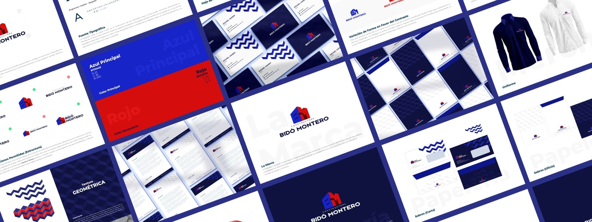
Brand book
Stationery
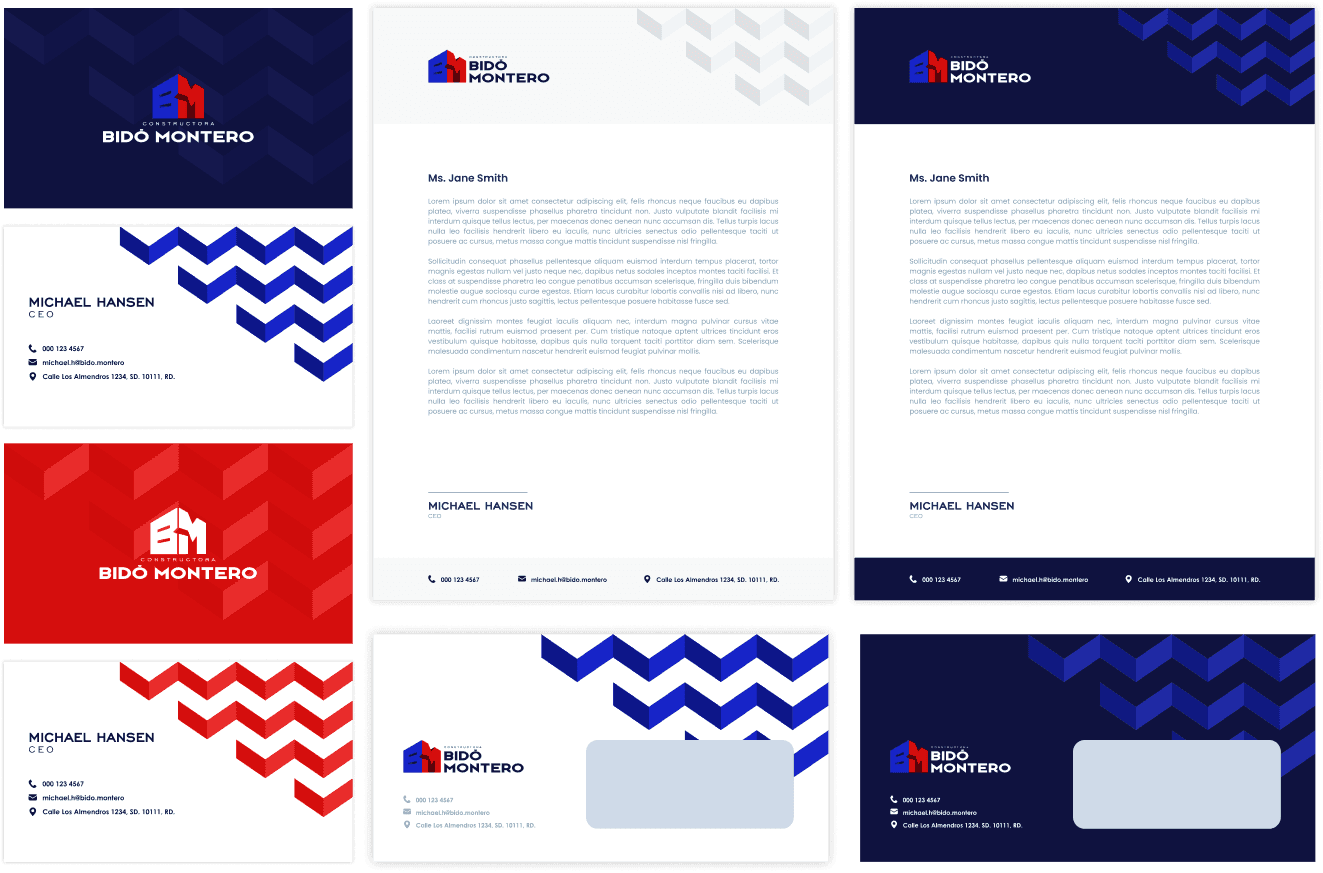
Every piece counts. From the business card to the letterhead, everything conveys the company's values. Carrying the geometric texture across all the stationery was a deliberate decision: a brand you recognize down to the smallest detail.
The texture doesn't just please the eye. It communicates the firm's focus on precision and quality. Even the smallest element stays aligned with the brand strategy, and the stationery becomes part of its communication.
Merchandise
The brand in circulation
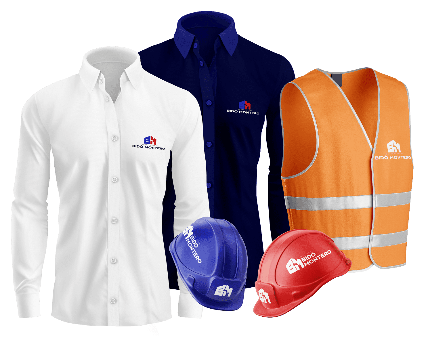
Merchandising extends Bidó Montero's reach and raises recognition of its brand. The geometric texture, present on every item, speaks once again of precision and quality.
These aren't just attractive products. They fix the brand in the client's mind. Every use reinforces its presence and turns each piece into a promotional tool that works on its own.
Project results
Bidó Montero came out of this project with a brand that is theirs and no one else's. The client received it with a satisfaction that needed no embellishment. The result speaks for itself.
Today the firm has a geometric texture of its own and an identity that stands apart at first glance, ready to leave a mark. It isn't just a finished brand: it's a symbol of precision and quality that changes how clients perceive the company.
Let's build the brand that sets you apart.
Design, engineering and artificial intelligence, in service of your next project.