

Charcutería Romana
Brand, packaging, website and social media for a maker of artisanal sausages and sauces. We built it fresh and professional — without losing the craft that sets it apart.
 Branding · Packaging · Web · Social · November 2018 · 6 weeks
The client
Charcutería Romana
Charcutería Romana is more than a company. It's the story of immigrants who found a small but flavorful gap in the Dominican market — and saw an opportunity in it: artisanal sausages and sauces with a taste you won't find anywhere else.
Their dedication to quality and tradition comes through in every bite. They didn't just open a business. They turned a craft into a brand, to share their flavors with the world. And that's exactly what they're doing today.
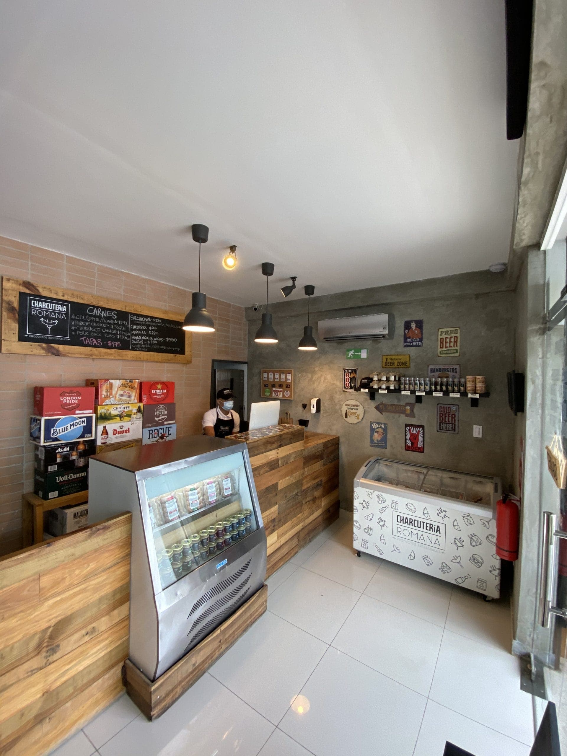
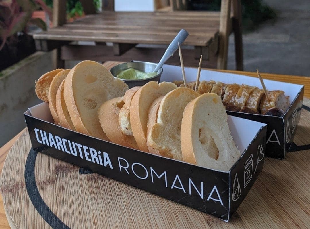
The challenge
Fresh and professional, without losing the craft
The challenge was bringing the concept to life in a way that was striking and well resolved, yet instantly recognizable on the shelf. The brand had to look fresh, clean and professional without losing the artisanal touch that defines it.
We solved it with judgment and precision. The result is a brand that inspires trust and stays in the memory. Every piece needed to sustain it was built with care, so it would work from day one.
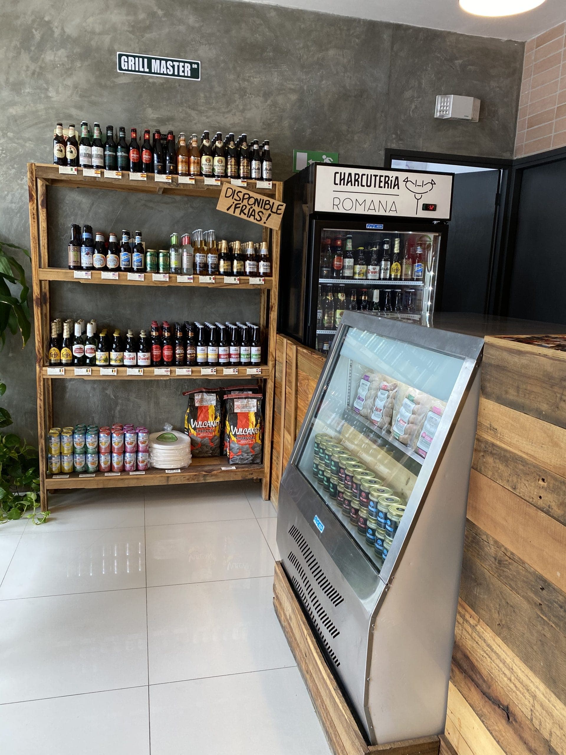
Branding
Logo design
To represent the brand at home and abroad, the first step was the logo. It had to embody what the company stands for: an artisanal, high-quality product that meets every health standard.
The goal was to convey trust at first glance, so consumers would feel confident choosing the product.
The logotype
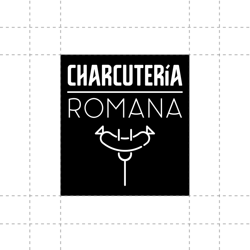
We researched their audience in depth and found a pattern: the product was enjoyed above all at family barbecues and cookouts. The logo had to tell that story with a clear graphic.
After weighing the options, we chose one of the kitchen's best-loved utensils as the base. The star product sits proudly on top of it.
In branding, less is almost always more. So we applied a simple, clean, well-resolved stroke that stands out in any medium. With no excess noise, the brand shines and leaves an impression that lasts.
Branding
Typeface selection
Next came choosing the typography to accompany the graphic work.
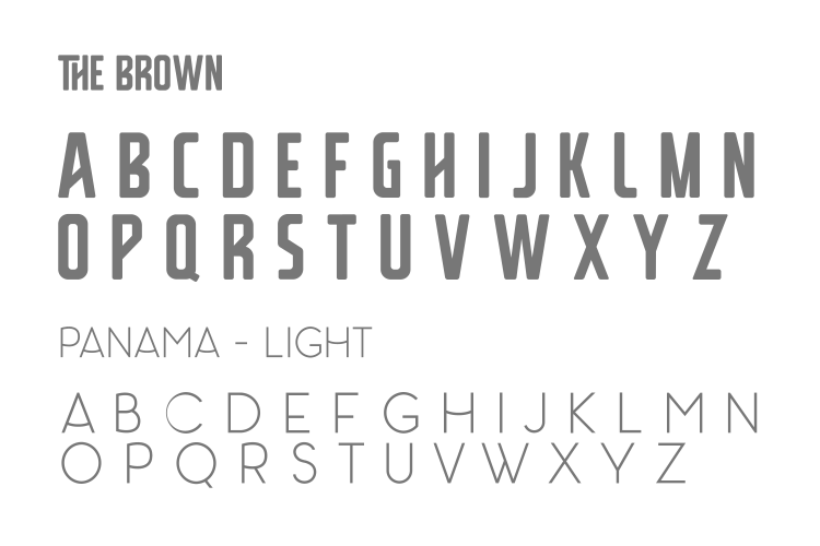
The brown
We opted for a tall, thin, old-style letterform with a slight 45-degree slant in its horizontal strokes. That variation gives it a personality of its own.
Panamá - Luz
As a second, equally important typeface, we chose its Light version. It keeps the same style and adds an elegant curve to the horizontals that makes it unique.
Color palette
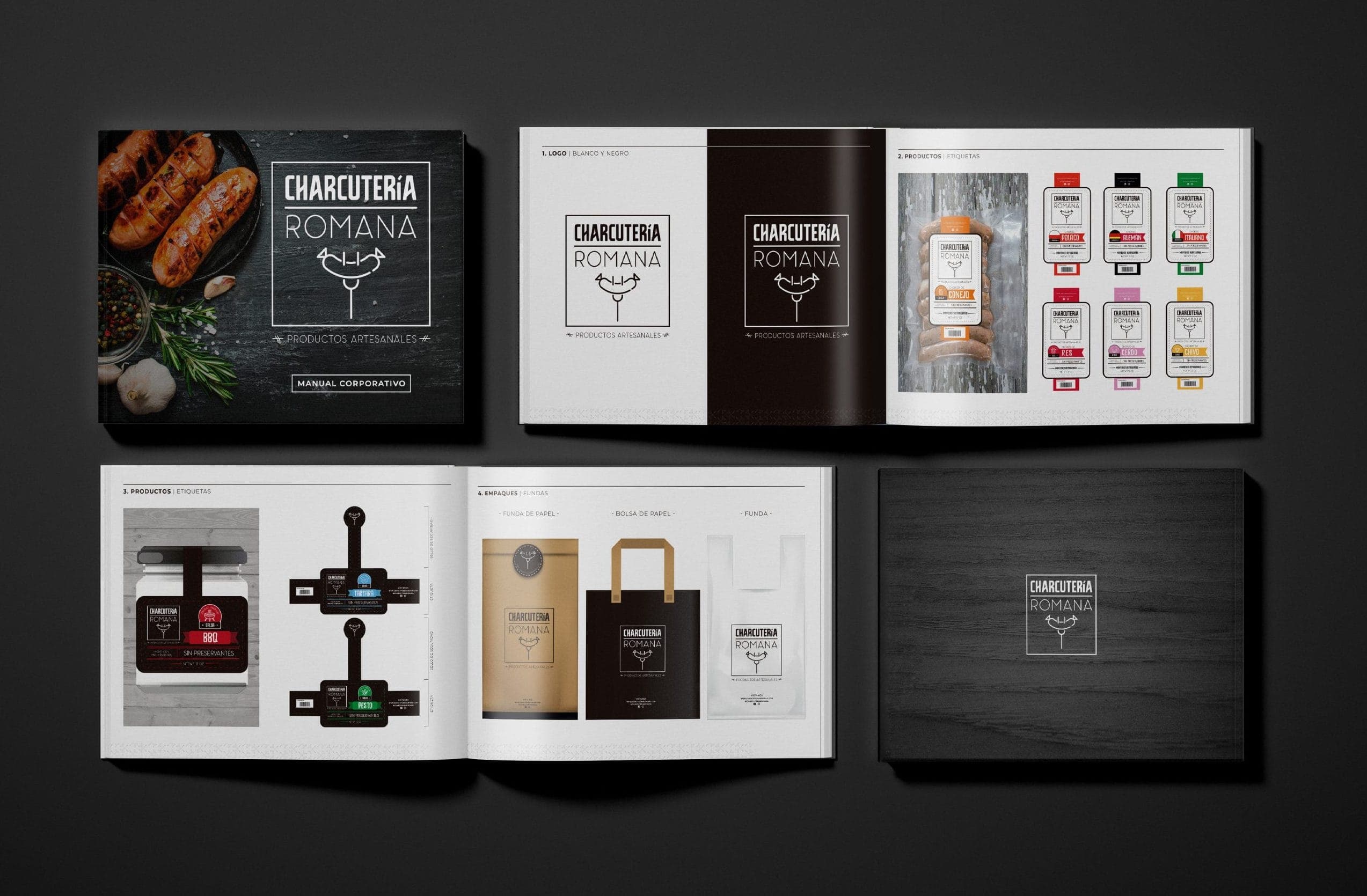
For the brand's color scheme, after many rounds of tests and sketches, we settled on the timeless combination of black and white. Holding back on color gives the brand an old-world, handcrafted feel — and leaves color free to differentiate each product in its own artwork.

Packaging
An image you recognize at a glance
A product image that commands attention was key to standing out from the competition. Loyal customers recognize the brand instantly. And new ones are drawn in just enough to take the product home.
We built a brand image that stays in the consumer's memory.
Sausages
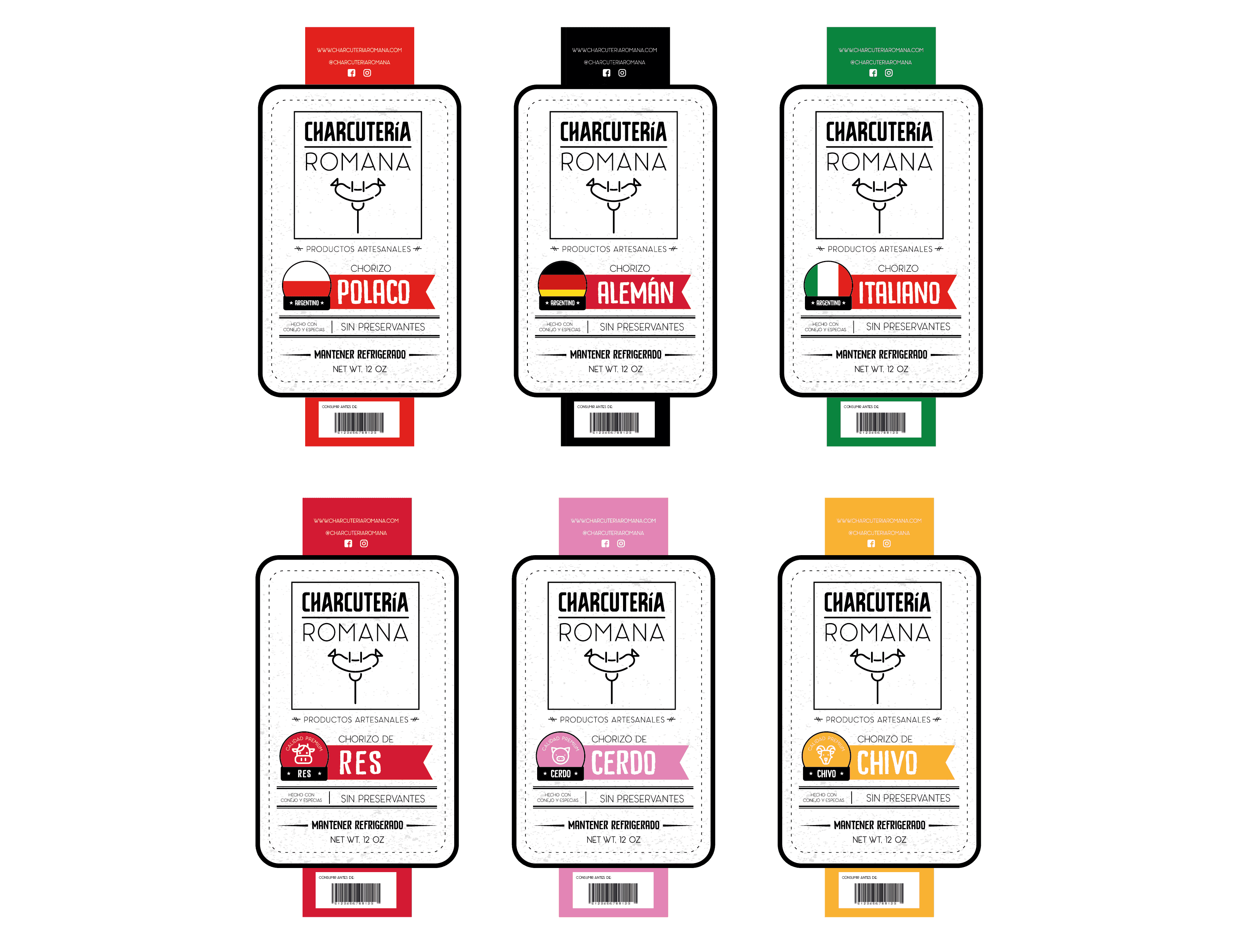
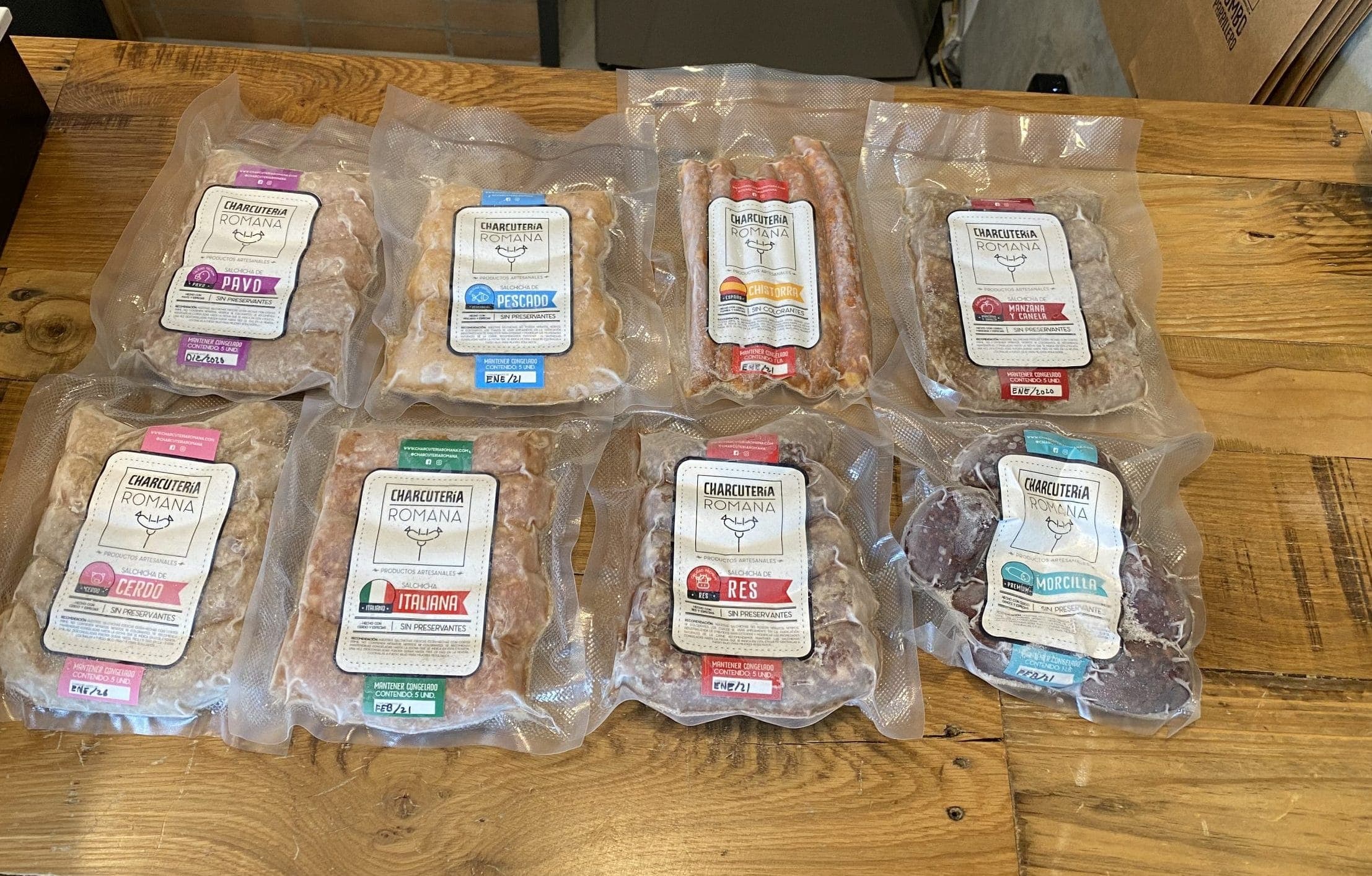
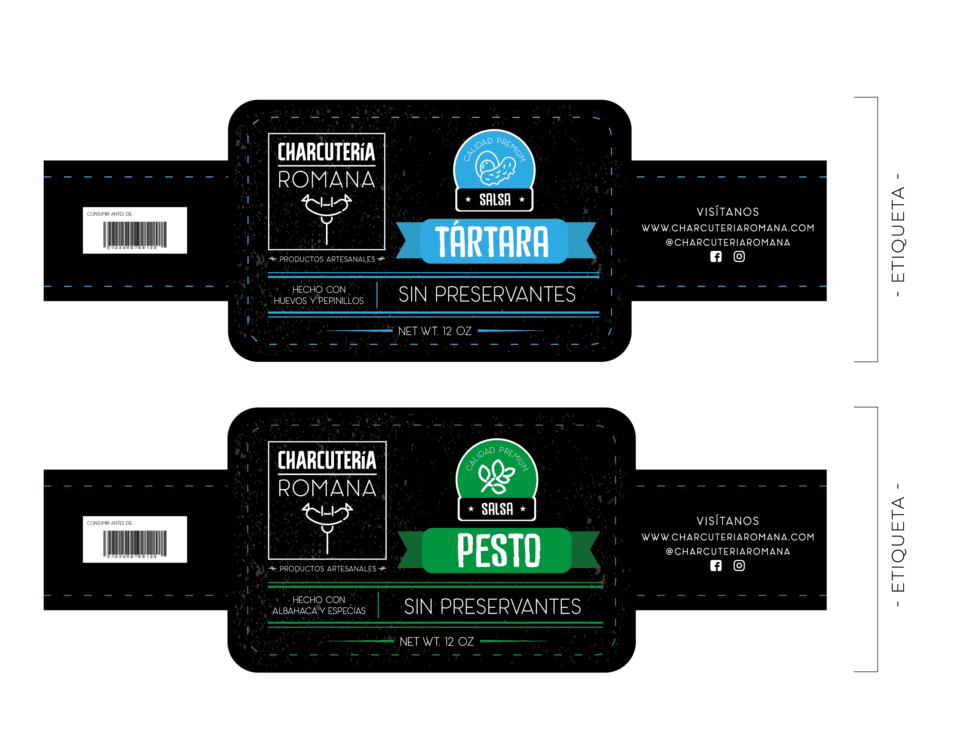
Picture the scene: you're strolling through the supermarket and come across a pack of sausages. They look juicy. But what's in them? How do you cook them? Every pack needs a wrapper that gives just enough information without covering what matters most: the product. Since the brand offers several flavors, the packaging had to be transparent, with room for the details and a color for every flavor. Below, the options we put on the shelf.
Sauces
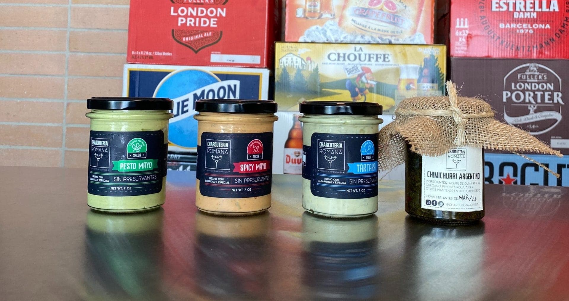
With the sauces, showing texture and color matters as much as it does with the sausages. That's why we chose glass jars: they reveal the freshness of the product and assure the customer of a first-rate sauce, ready to serve. How do you tell one flavor from another at a glance? The brand has it solved. Following the same principle as the sausages, we assigned a color to each sauce flavor. Flavor, without the confusion.
Design
Website
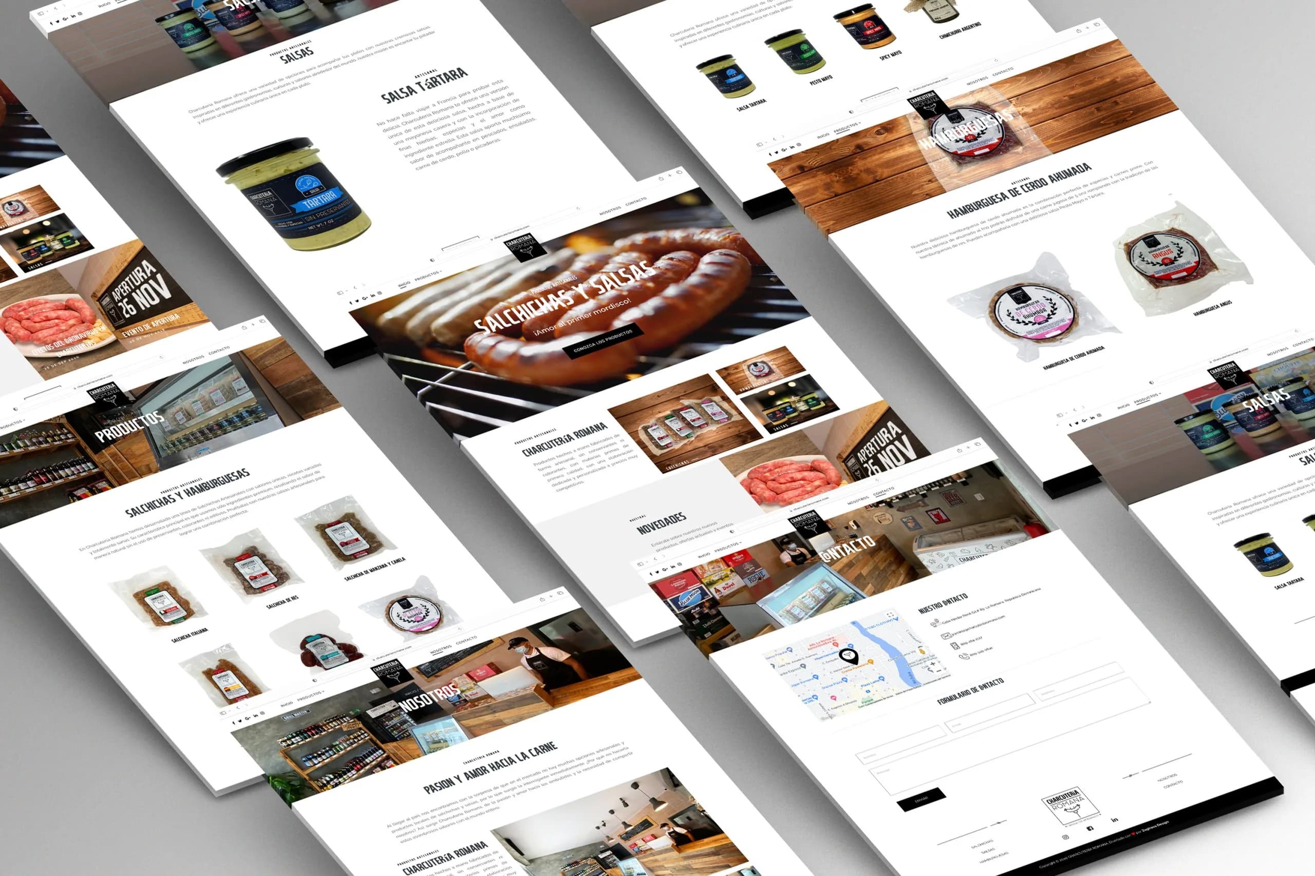
With the brand ready, it was time to present the product to the world. We built a website where customers come in and order everything the company offers — no detours.
We put up a simple, intuitive interface with navigation that explains itself. Customers browse the catalog and order what they need in just a few clicks.
CMS
Joomla! CMS
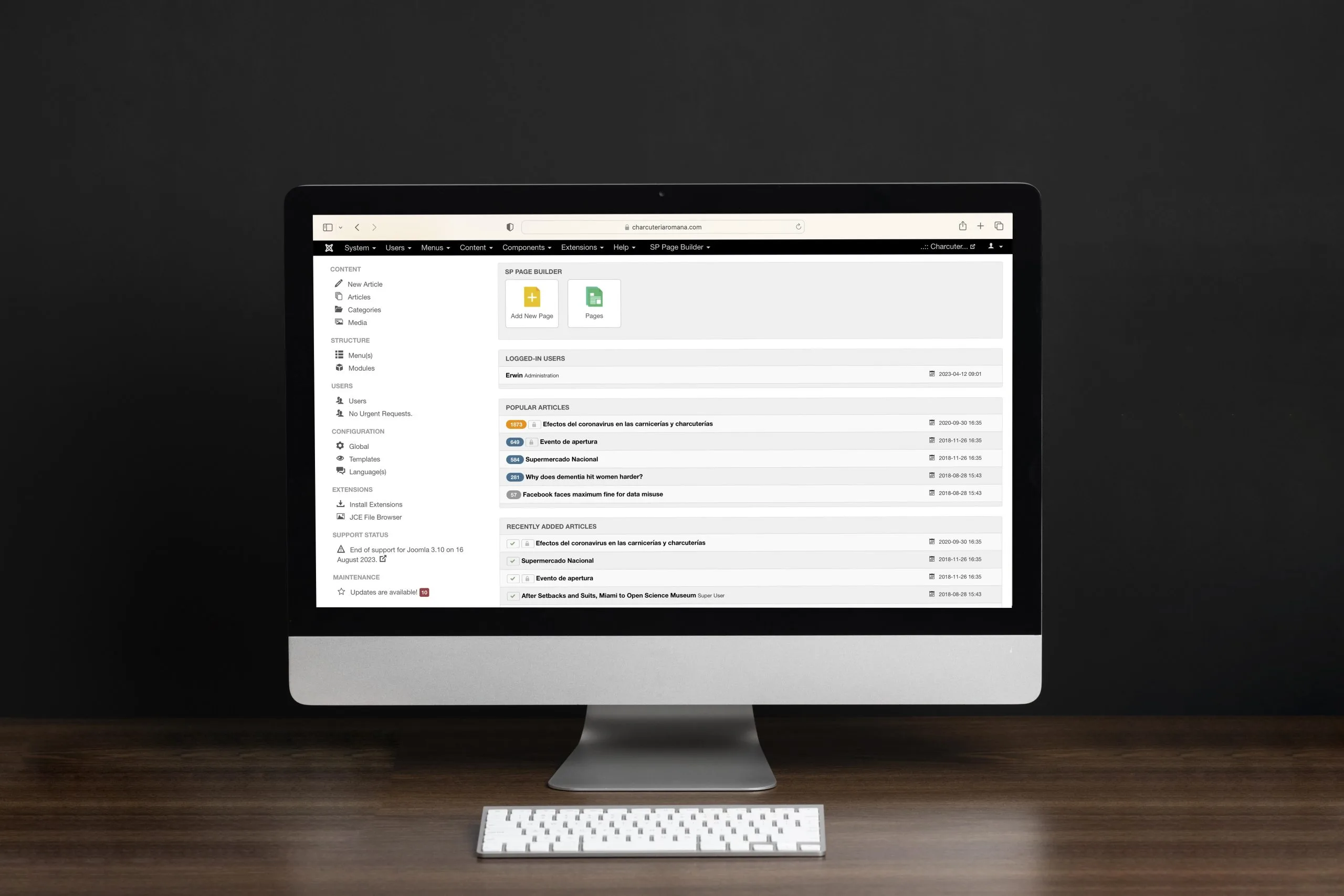
For this site to work, it needed a content management system that was complete and easy to operate. Enter Joomla: an interactive, manageable system with every plugin the site needs to run without a hitch.
Core components
- SP Page Builder
- J2Store
- Forms
- Smart Slider 3
- Google Maps integration

Development
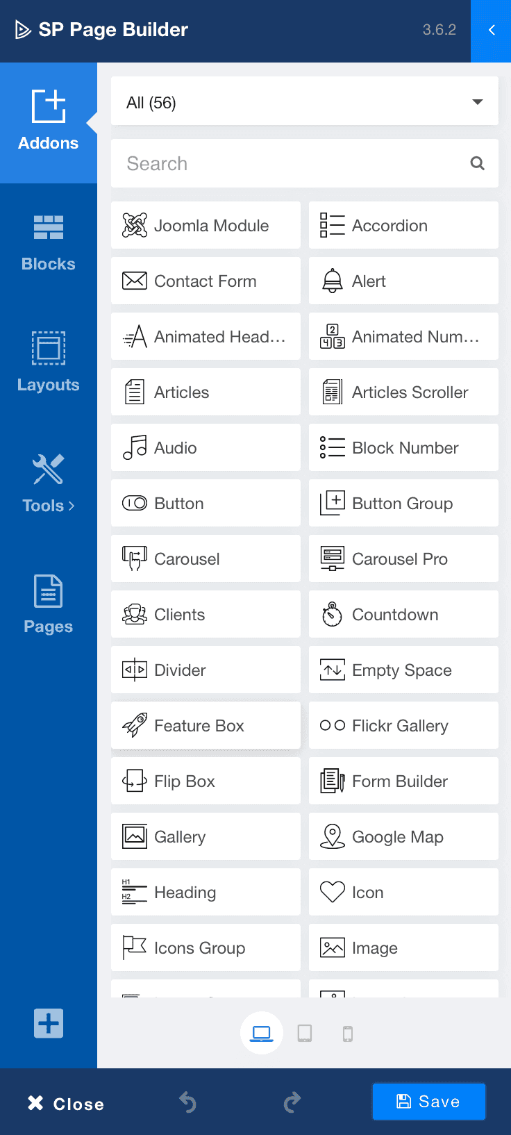
SP Page Builder
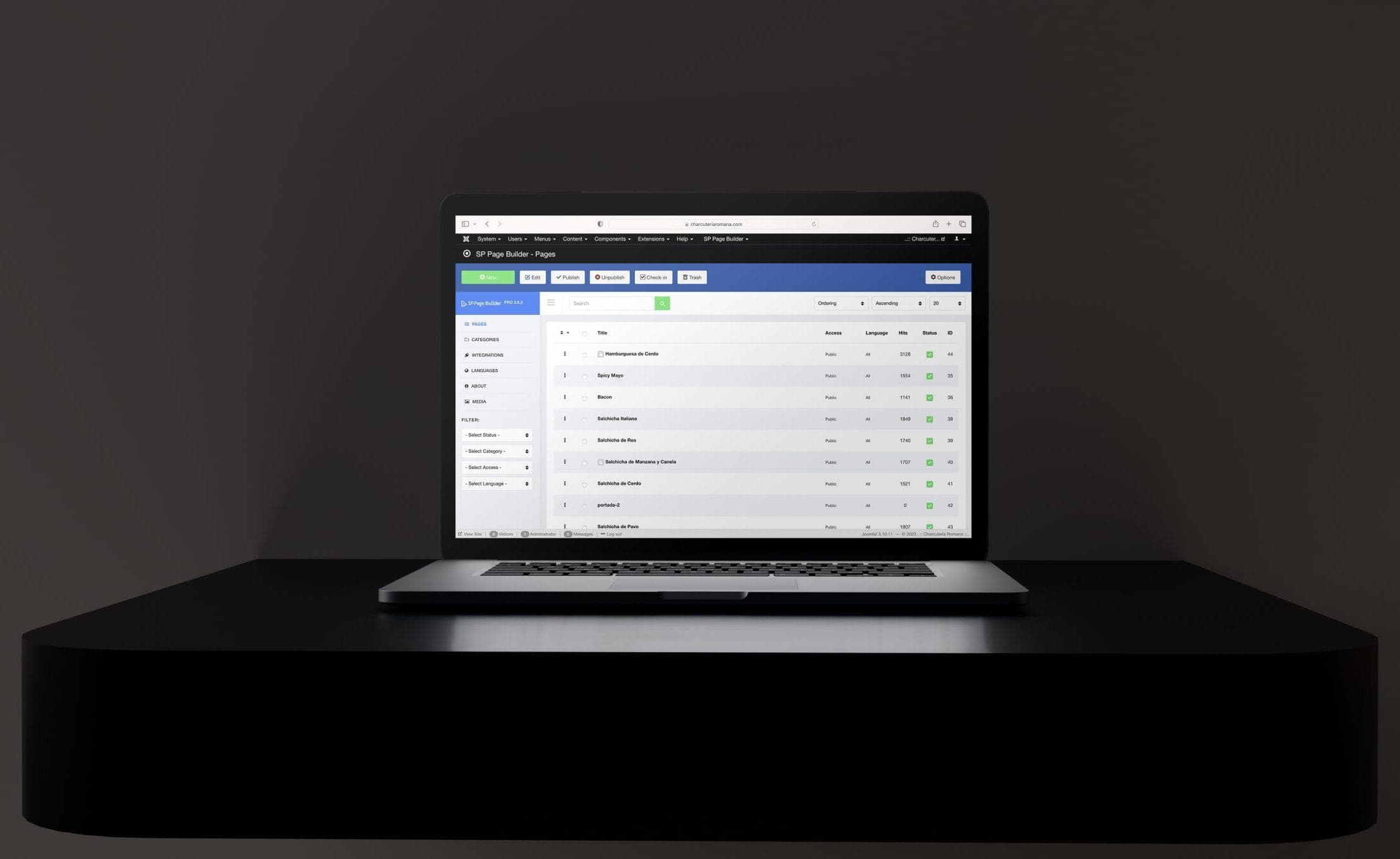
As one of Joomla's leading page builders, SP Page Builder was key to assembling and styling every page. Its versatility made it an indispensable part of the development. With it, we built professional-looking pages with minimal effort.
An easy-to-update interface let us integrate every feature seamlessly, to deliver the best possible experience. And thanks to agile maintenance, that experience holds up over time.
Social media
100% natural, told on every platform
Promoting the brand wasn't just about selling the product. We wanted the public to understand the value of consuming 100% natural products. So we brought Charcutería Romana to several platforms, sharing nutritional information, tips and best practices.
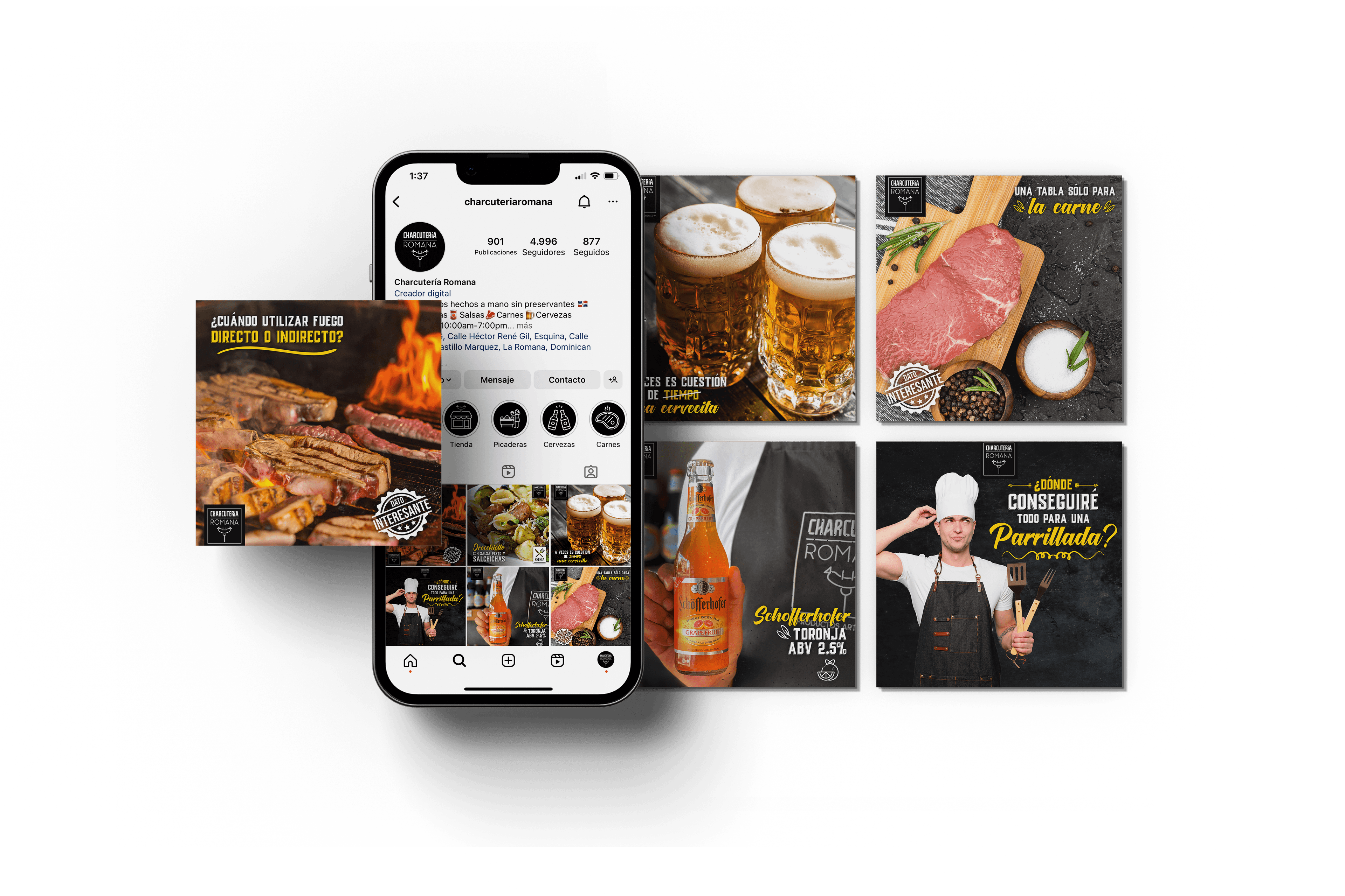
On Instagram we built a community where customer questions get direct, personal attention. Want to browse your favorite brand's full catalog without the hassle? Now you can: with the digital catalog, customers reach exclusive offers in a single tap. Less friction, better buying.
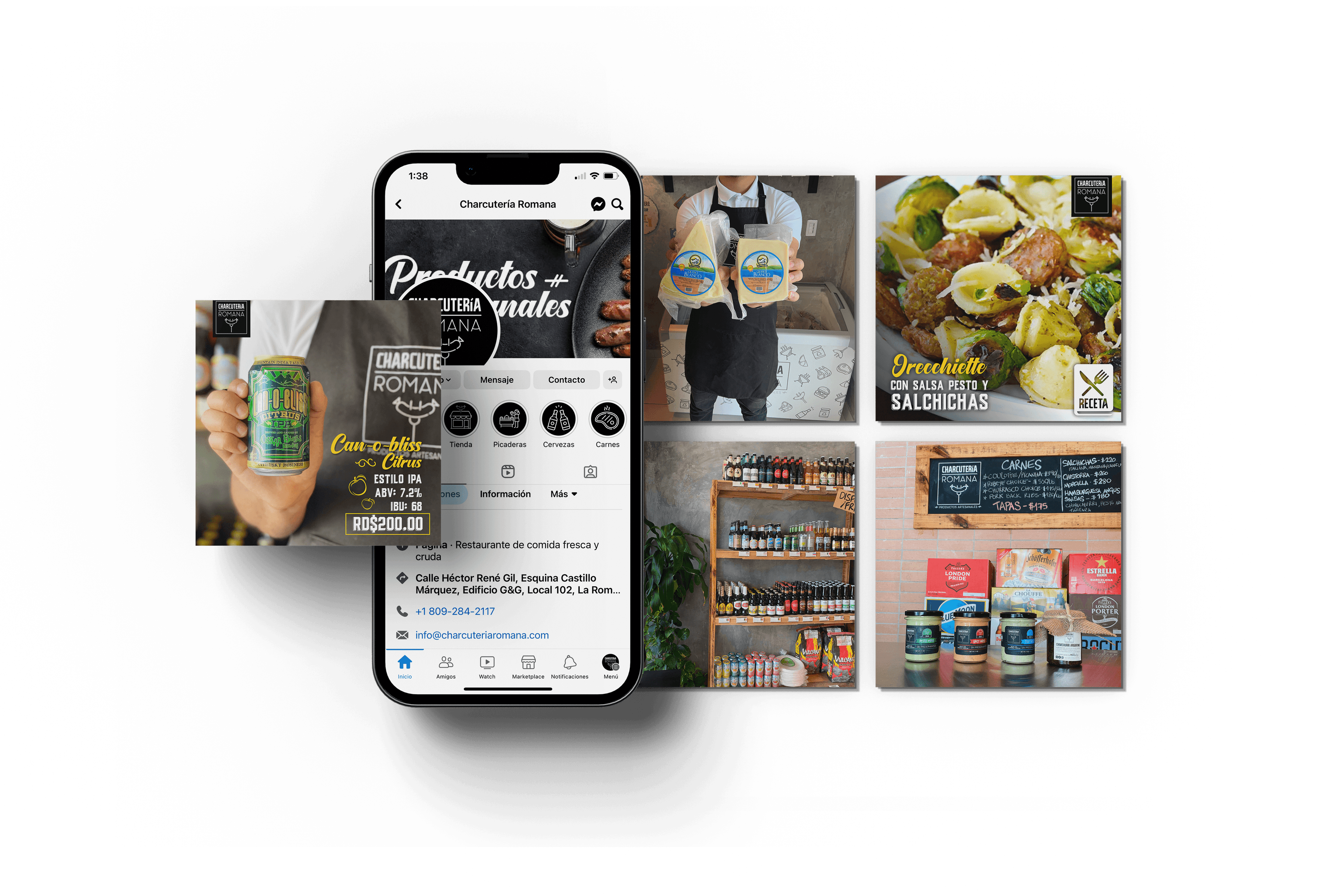
We put the platform's tools — Marketplace and Facebook Ads — to work positioning the brand at home and abroad. Targeted, goal-driven campaigns, built to reach exactly the audience we wanted to connect with.
Conclusion
Charcutería Romana was a demanding, exciting project. The goal was to build a 100% natural brand, within every family's reach, with a nutritional profile designed for everyday consumption.
We put every technique it took to work. The result is a high-quality product presentation, made to be enjoyed.
“
We had an incredible experience with Zagirova. Our concept began as a foundational idea that took shape thanks to the team's guidance. There was always excellent communication between both sides, and the results were extraordinary.
Among the highlights: fast responses, positive feedback on the ideas we brought, patience throughout the process, highly professional management of the relationship, innovative ideas, end-to-end project management and follow-up after launch. In short, Zagirova is an excellent company to work with and to grow any business. The staff is exceptionally qualified and very attentive.
 Jehan Ramírez DíazBrand owner
Let's build your brand and put it to work.
Design, engineering and artificial intelligence, in service of your next project.