

Bido Montero
A Dominican motorcycle service company that already led its field. We built them a brand equal to that position.
 June 2021 · 2 weeks
Client
Bido Montero
Bido Montero repairs and maintains motorcycles of every engine size across the Dominican Republic. More than four years of craft, talent and Dominican ingenuity, put to work for every customer.
A demanding client roster pushed them to the front of their field. The brand had to rise to meet it.


Challenge
A forward-looking brand, true to its essence
Build a forward-looking brand that reflected the company's exclusive services and products — and caught a prospect's attention at first glance.
The client knew exactly what they wanted: a high-end motorcycle translated into visuals, in their colors, with an elegant typeface connecting the brand to its ambition.

Branding · Logo design
Four proposals, one vision
A good logo doesn't appear out of thin air. We explored four distinct routes, starting from the client's own ideas — each one a different way of bringing their vision to life. That experimentation led us to the final design: clean, memorable, and able to communicate the essence of the company in a single stroke.
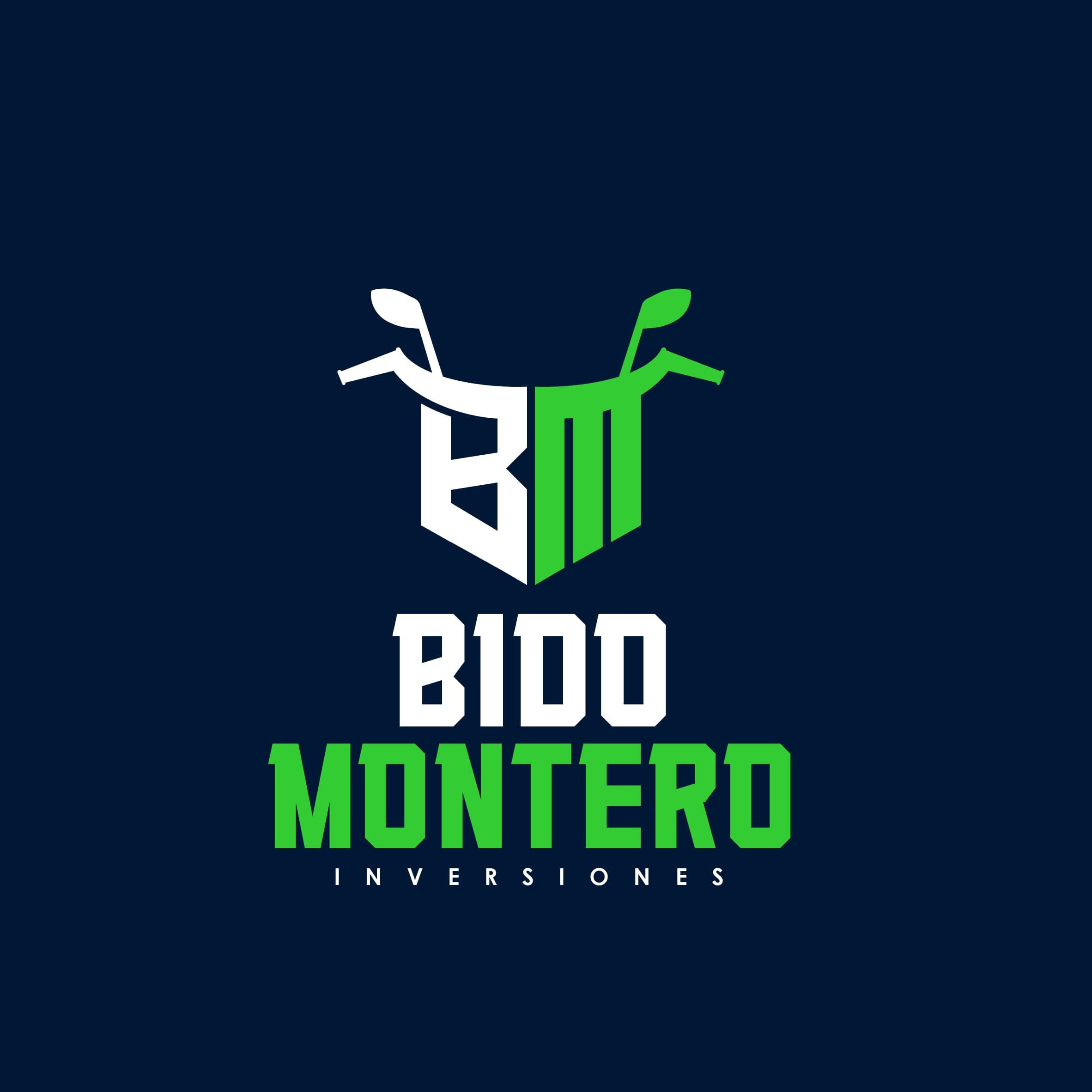
Proposal no. 1
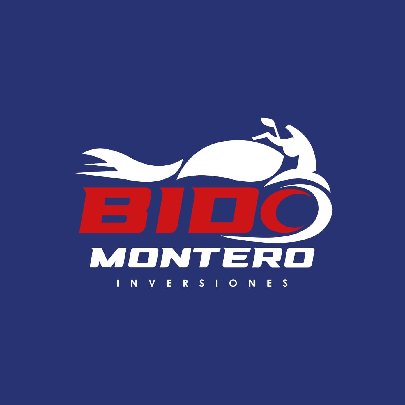
Proposal no. 2
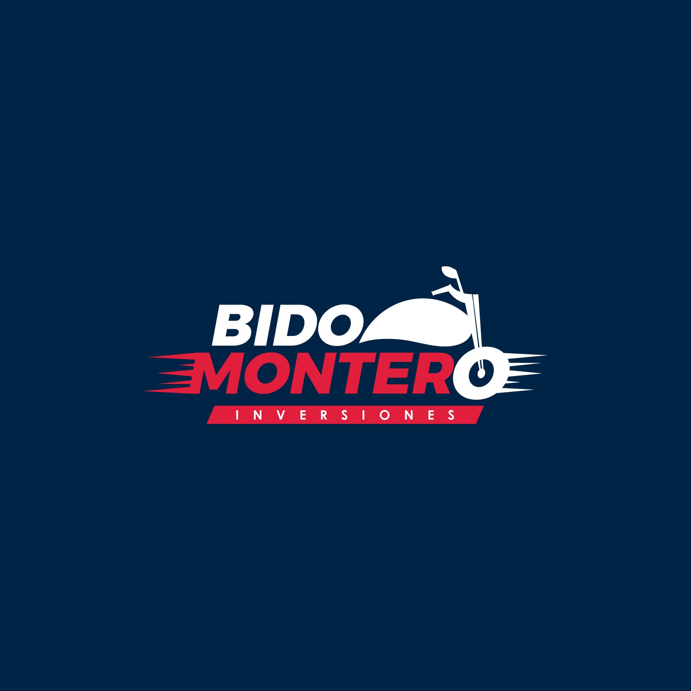
Proposal no. 3
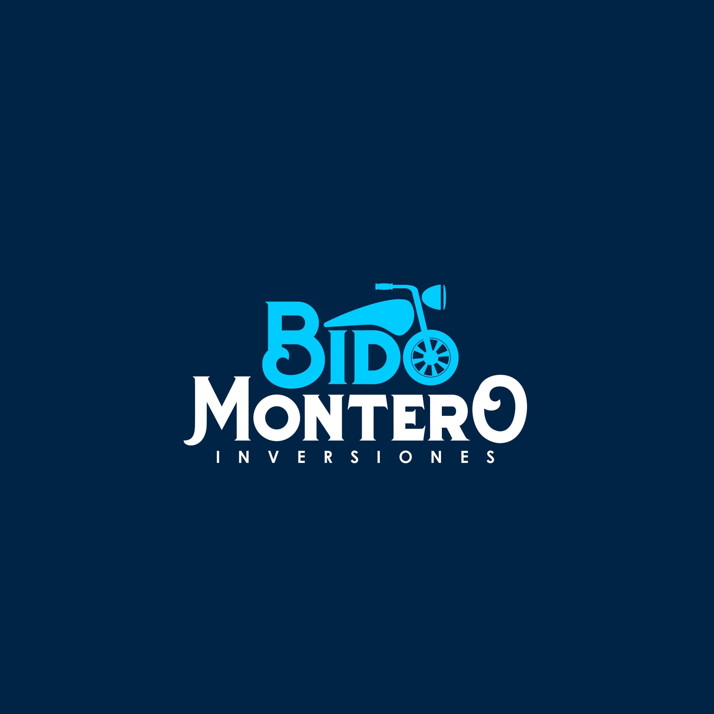
Proposal no. 4
Branding · Logo selection
The client chose the second
After weighing all four proposals, the client chose the second. The deciding factor: its versatility — just as strong in print as on screen.
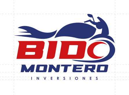
The logo is born from the silhouette of a motorcycle. The lettering weaves into the drawing, and the front wheel becomes part of the name. Bold waves and sharp accents evoke the speed and precision of their services.
Typeface selection
A typeface with a technological edge
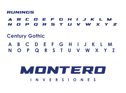
We chose a typeface that would ride alongside the logo with a technological edge, aligned with the psychology of the brand. The font brings momentum to the entire identity.
We brought in Century Gothic as the complementary font. It performs just as well on the web and social media as it does in print, adding a note of sophistication to every piece of communication.
Color selection
Blue and red, an analogous palette
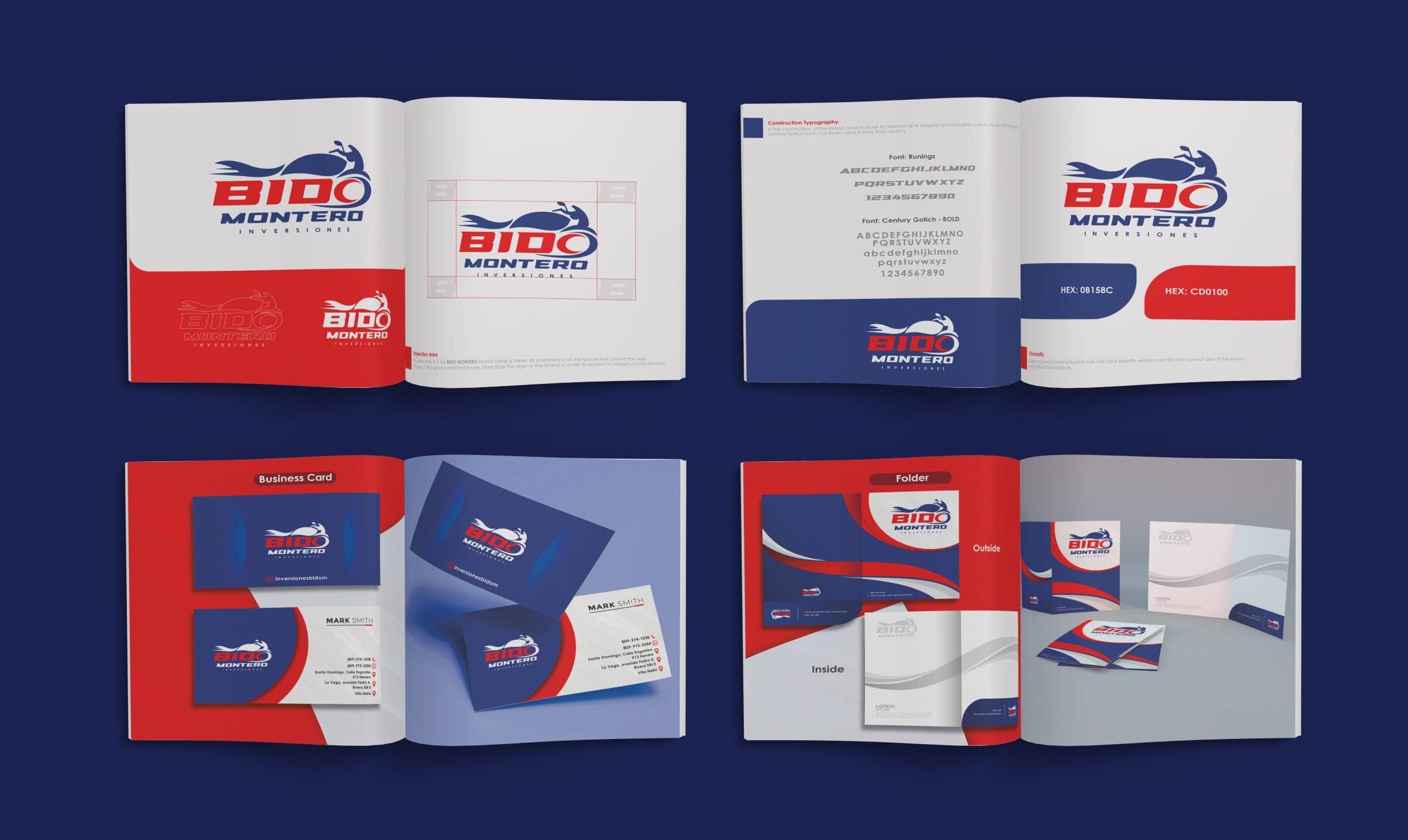
Bido Montero's color system starts from an analogous palette built on two bold colors: blue and red. Blue leads, conveying trust and clarity.
Red comes in as a strategic accent. It expresses Bido Montero's commitment to its customers and gives every product and service a vibrant energy.
Rebranding
A new corporate image
We built a digital presentation to introduce the new corporate image and showcase, with force, everything this business has to offer.
A storefront that walks the public through every pillar and every offering of the company — the opening of a new era for the brand.
Rebranding
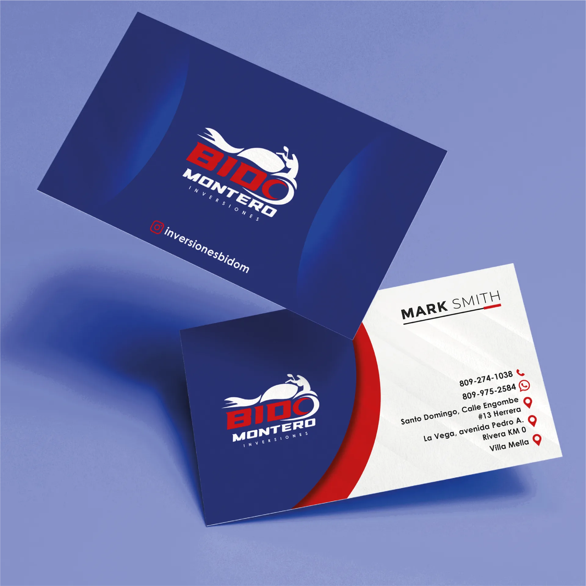
Corporate stationery
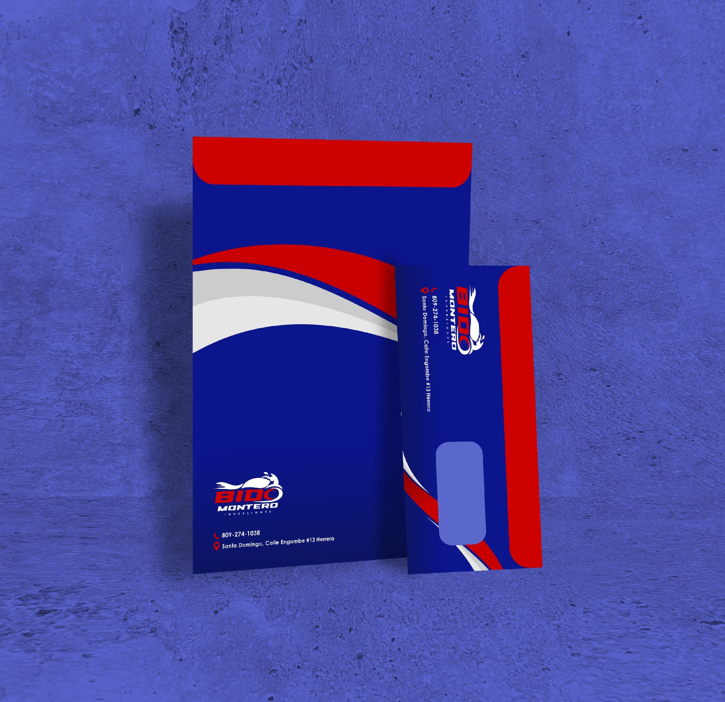
True to the philosophy of the logo, the stationery had to breathe flow and cleanliness, with blue up front and red as the accent. Elegant curves and a daring red deliver a result that radiates professionalism and character, faithful to the essence of the brand.
Century Gothic anchors the identity as the primary font. The decision improves both the legibility and the aesthetics of the whole.
Rebranding
Brochure design
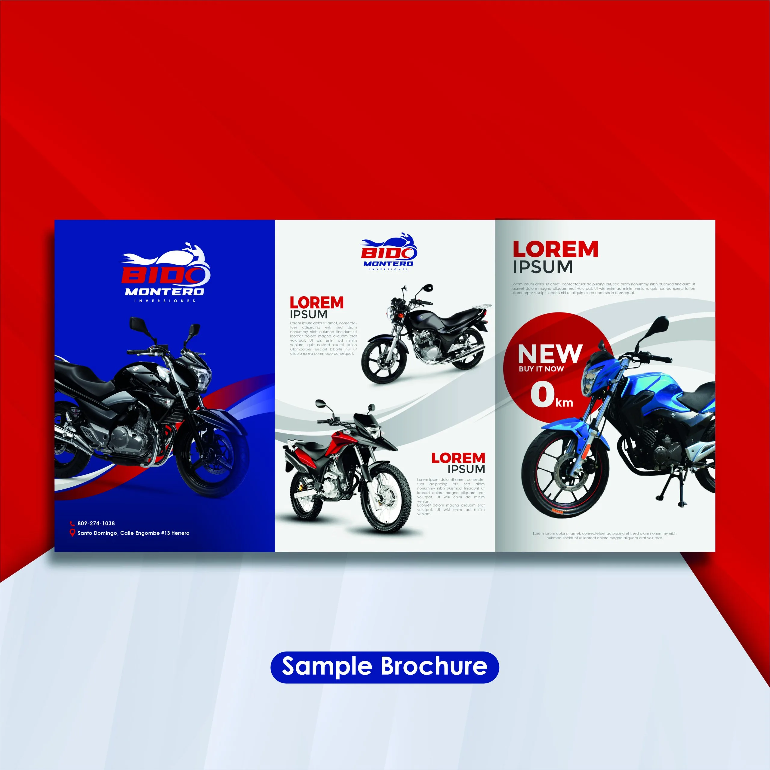
Graphic consistency was key across the entire project. The brochure — clean and distinctive — shows every side of the brand without losing its personality.
We worked a balance of light and shadow into an immersive read that captivates without overwhelming. Clearly defined sections that carry the values of a brand integrated from start to finish.

Conclusion
More than the sum of its parts
Every piece had to work with the others until it hit the exact mark: a well-built brand with a clear concept and solid foundations. A cohesive visual identity where every detail counts and the whole is worth more than the sum of its parts.
A strong brand is not a logo or a slogan. It is an experience that connects with the customer on a deeper level.
We put craft and judgment into every decision, faithful to the client's vision, to place the brand where it belongs in the market: visible, memorable and easy to recall.
A project that brought out our best — and became a success story we love to tell.
“
Your team of professionals did an excellent job with Bido Montero's rebrand. The new logo and color palette capture our identity perfectly and have significantly elevated our brand image. The quality of the design across the stationery and brochures is impressive. We are very satisfied with the result and grateful for your dedication. We look forward to future collaborations.
Your brand also deserves an identity that matches its stature.
We build it and put it to work. You get a brand ready to compete.