

Caprice Organic
Brand, packaging and website for a Dominican organic fruit line built for export. Made to win the shelf and open markets abroad.
 Brand · Packaging · Website · November 2019 · 6 weeks
The client
Caprice Organic
For nearly a decade, CH Export Srl has shipped premium Dominican fruit to the United States. Its production and packing systems are built so the product arrives fresh, tasting just as it does at the source.
The Caprice Organic brand was born in 2016 to answer a specific demand: purely organic fruit — no dyes, no preservatives — with its original properties intact. A natural product, no shortcuts.
The challenge
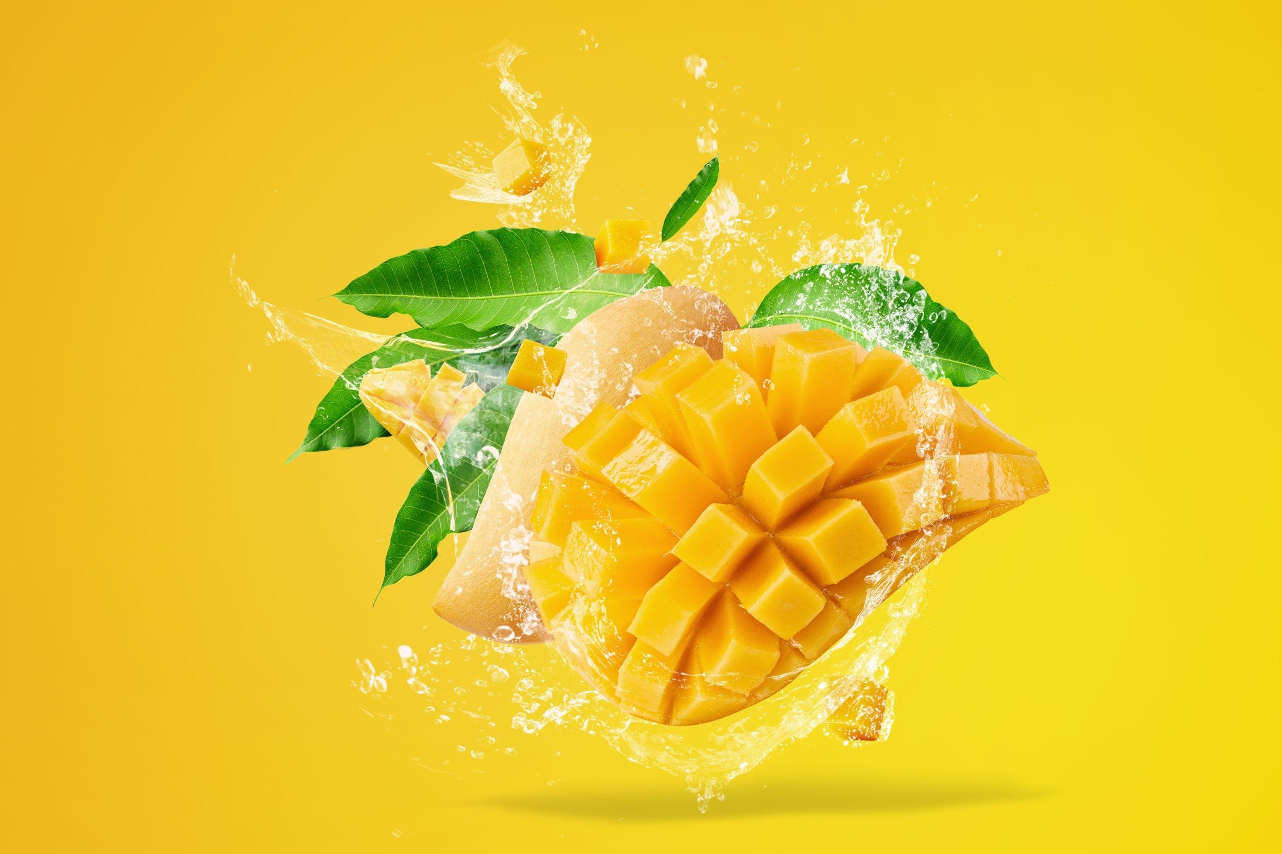
Taking the mango to the global market
The mango was the key to entering a global market and reaching places where a fruit this exotic is hard to come by. An organic product, consistently fresh from origin to table.
We built an identity that puts those fundamentals front and center. The goal: for shoppers to feel they are choosing something different the moment they see it in the supermarket — and for the brand to read as a global company they can trust.
Brand · Logo
An identity built from scratch
A brand that connects with its audience is never improvised. Every element — the vectors, the typography, the palette — was defined to carry the company's vision onto the shelf. We started from zero and built an identity of its own.
Inspiration for the logo
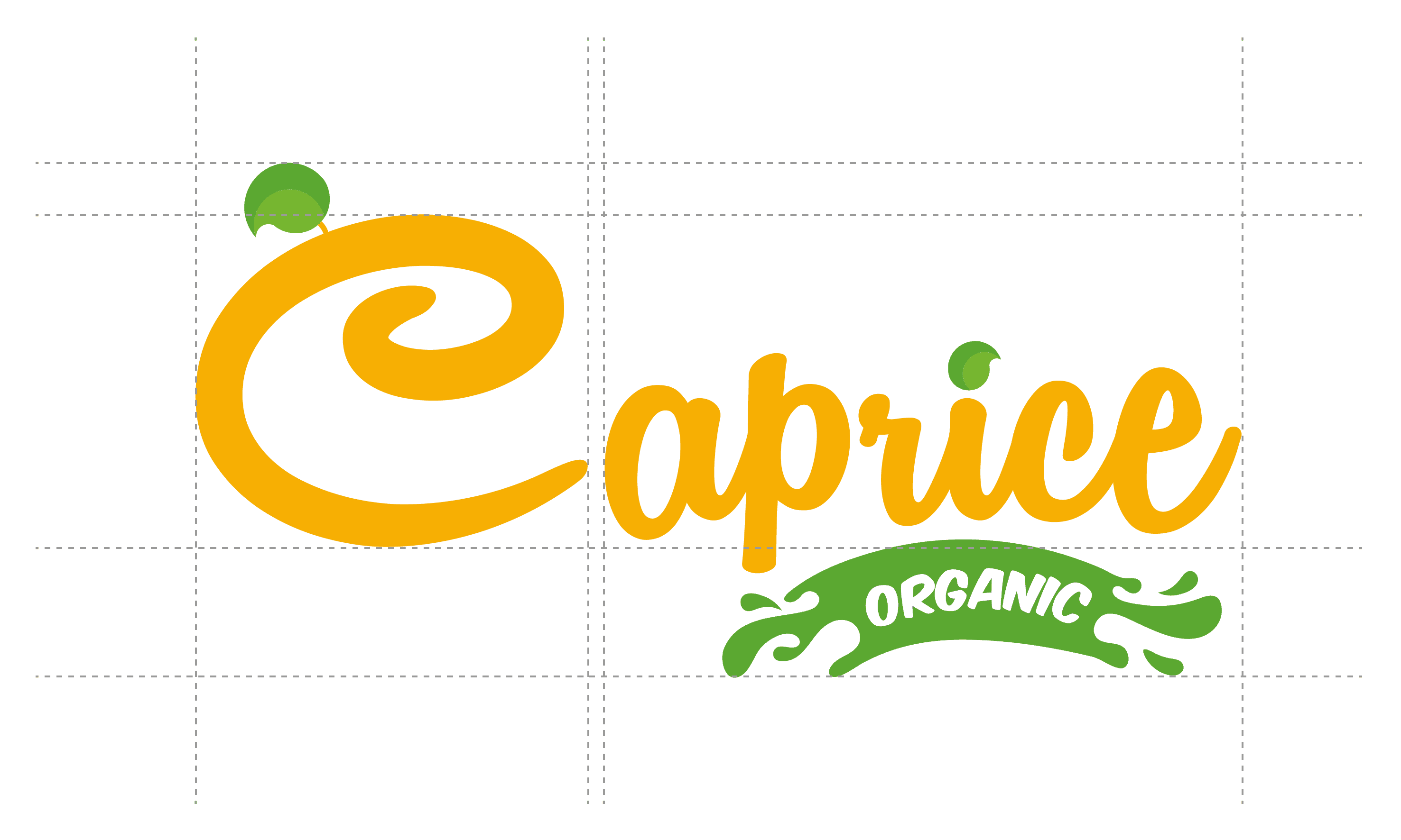
We took the fruit as the starting point and shaped an implicit mark into the letter C. A leaf at the top finishes the symbol and gives it the character of a brand.
The glossy, vibrant finish of the organic label conveys just how fresh and juicy the product is: the original flavor, in its premium form.
Typography
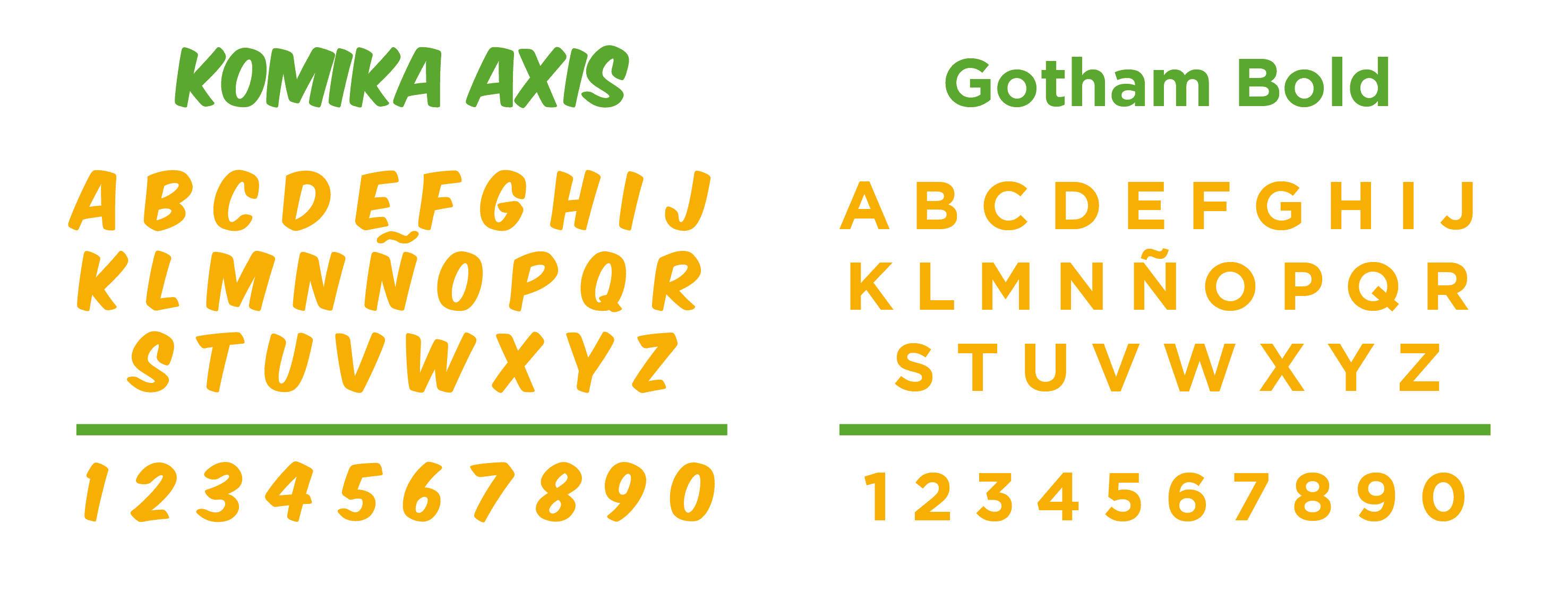
Komika Axis and Gotham
Komika Axis. A stylized typeface that gives the logo another dimension: bold and memorable, without sacrificing legibility or impact. A visual signature that sets the brand apart from the competition.
Gotham. For digital and print media we chose a versatile, high-impact typeface. The message holds up on any medium.
Color selection
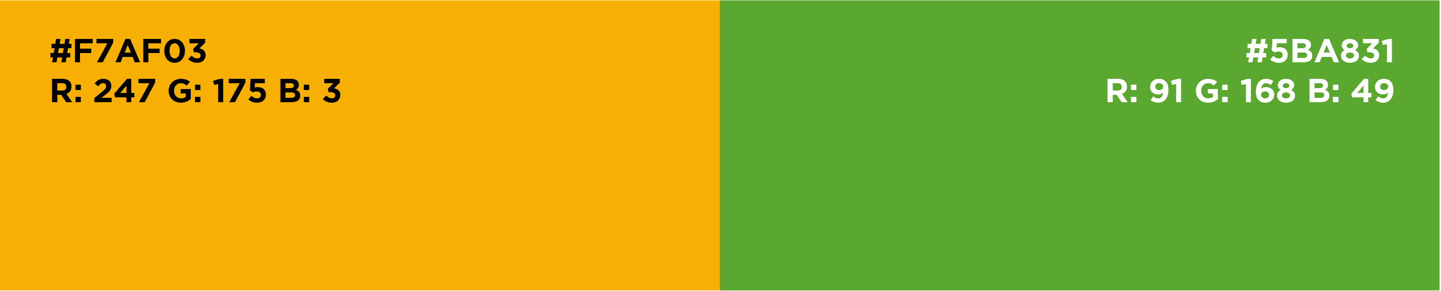
Yellow and green
We chose yellow and green as the brand's own colors. The aim: for shoppers to recognize the product instantly, just by seeing those tones. That immediate connection was key to positioning Caprice Organic in the market.
Packaging
Packaging that preserves and captivates
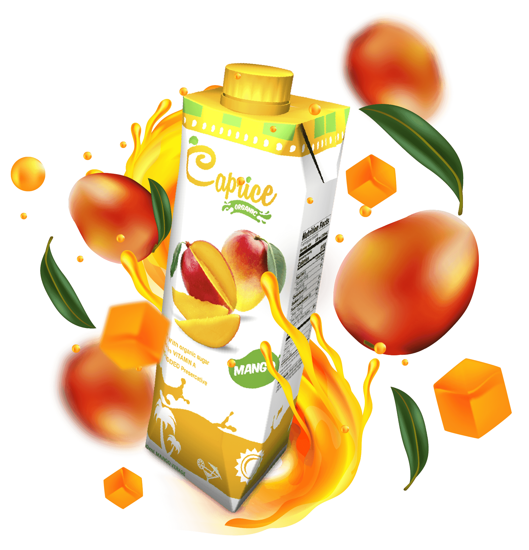
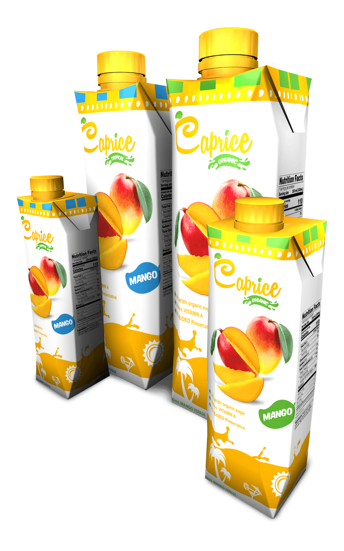
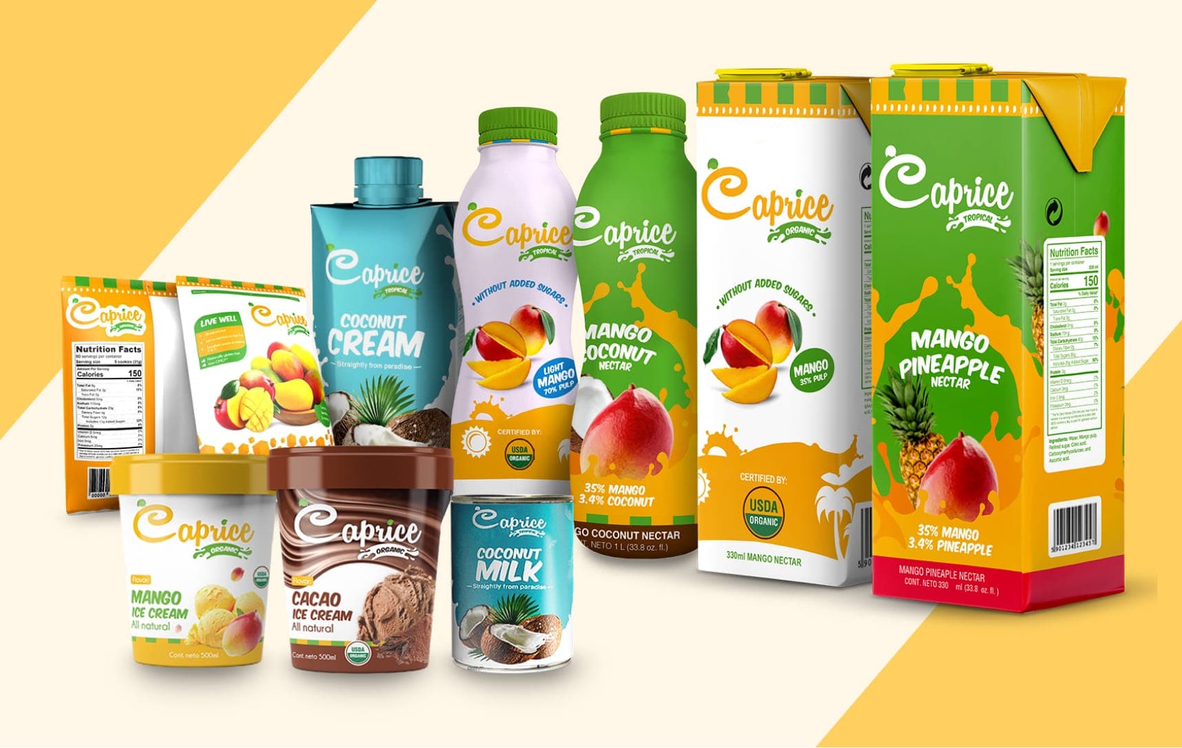
The packaging had to do two things at once: stop shoppers at the shelf and keep the product fresh through its expiration date. Striking on the outside, uncompromising on preservation.
We worked through every detail — the container, the shelf presence, the production quality — to deliver goods people can trust day after day. Every product carries its nutrition facts, shipping and expiration dates, and barcode.
Creation
Mango nectar
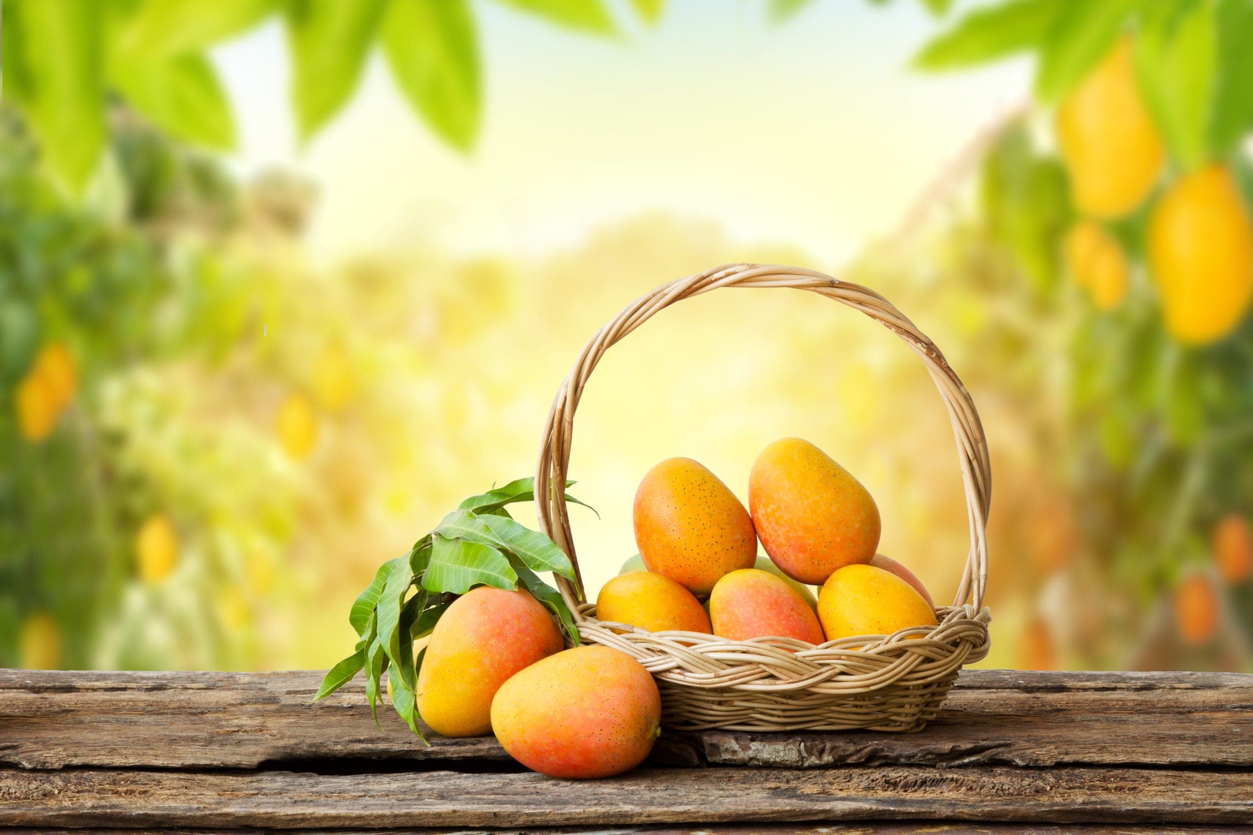
Caprice Organic mango nectar is made from natural, organically farmed mangoes, ripened in the sun and selected for their sweet, juicy flavor. The result is a fresh, fragrant nectar: natural taste and convenience in every glass.
Creation
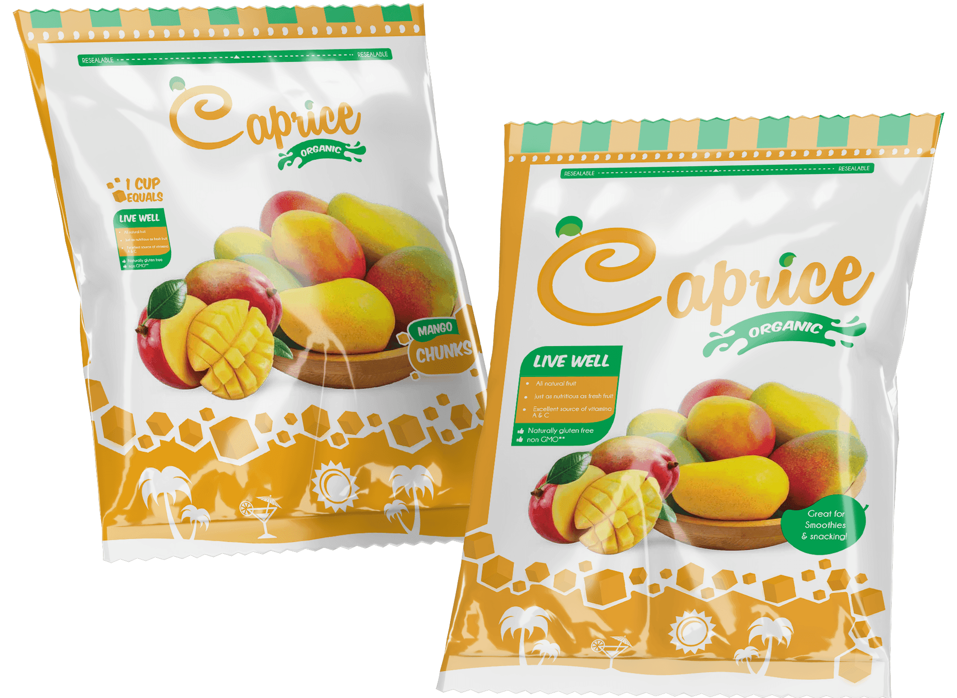
Mango chunks
Caprice harvests its mangoes at the peak of the season to guarantee quality fruit. Each piece is washed, thinly sliced and ready to eat: perfectly ripe, with no prep on your end. Enjoy it on its own or with yogurt at breakfast — and it is just as good for topping, baking or building a fruit salad.
Web design
Easy access, global reach
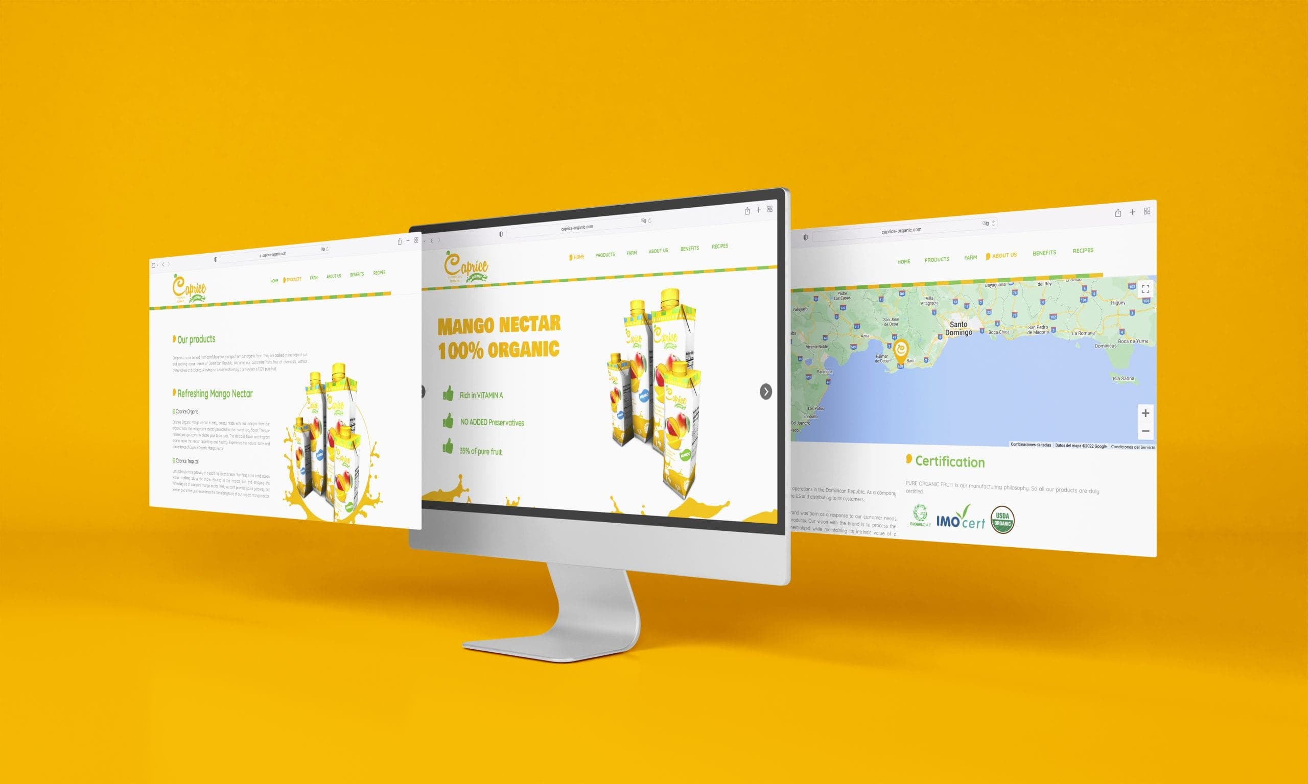
We built a site to introduce the brand and put the product within reach of consumers around the world — even where a fruit like this is hard to find. The objective: win international share and move more export volume.
The platform loads comfortably on any device or browser. Accessibility is taken seriously: a friction-free experience for anyone who visits the site.
Website
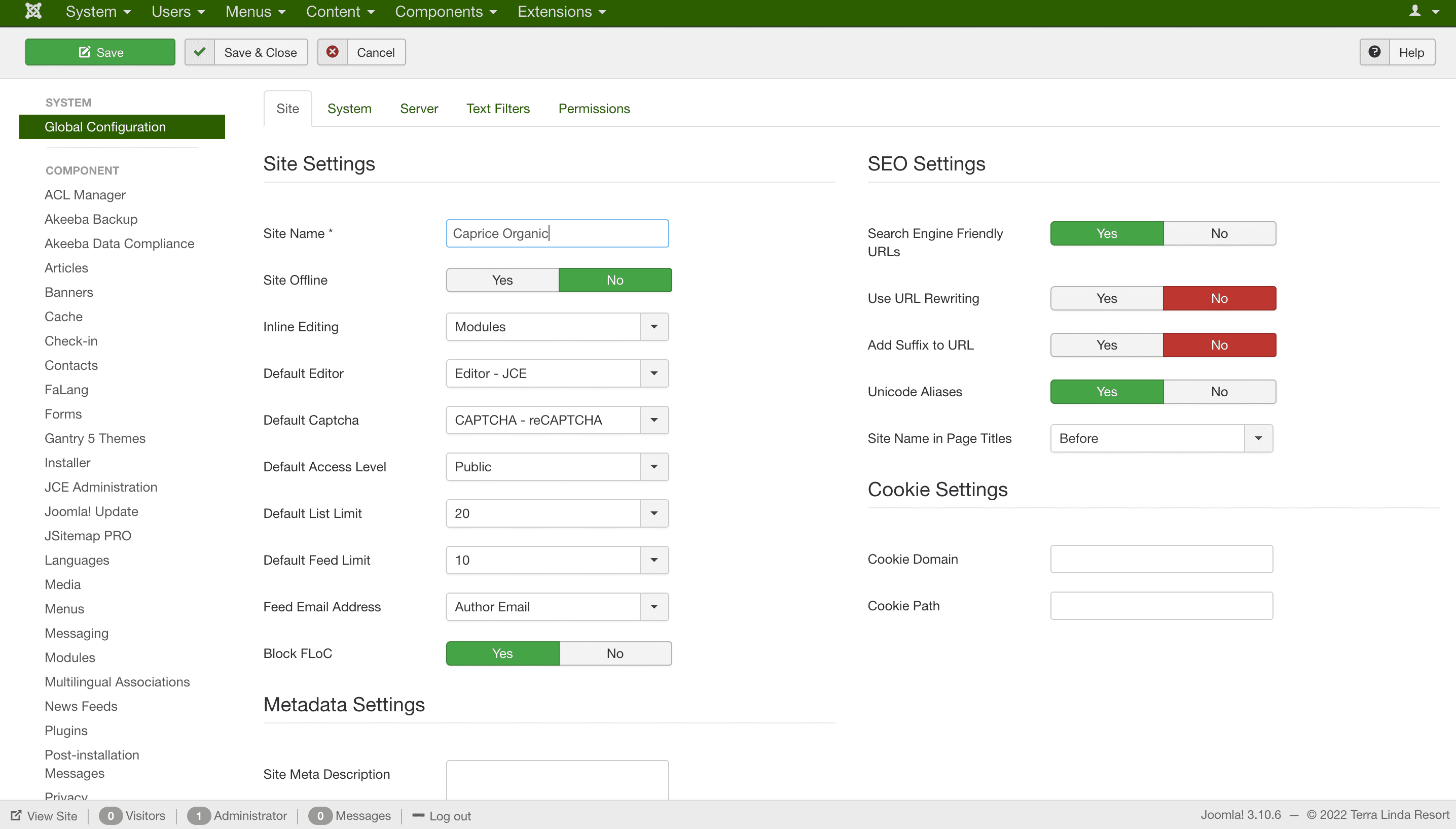
Built on the Joomla CMS
To deliver a professional site quickly and at the right cost, we chose Joomla as the content management system. The platform let us stand up an attractive, dependable site without compromising on quality or budget.
Because it is open source, Joomla carries no license fee. A sustained saving the business reinvests in other areas.

Conclusion
We took on every challenge with commitment and delivered a project that met exactly what the client was looking for.
We stayed true to their vision, met every deadline and gave the brand a contemporary identity, ready to connect with its consumers.
“
Working with the team of professionals on Caprice Organic was a game changer. They gave our brand a vibrant new look and created packaging that truly stands out. On top of that, the website runs smoothly and puts us in front of more eyes around the world.
Christian HolguínFounder · Caprice Organic
Your next brand, ready to win its market.
Engineering, brand and artificial intelligence behind your next project. We build it — and put it to work.