

Paradise Tours
We built the visual identity and brand book for a tour company that takes travelers to the untouched beaches of Samaná.
 Jul 2023 – Sep 2023
The project
Paradise Tours
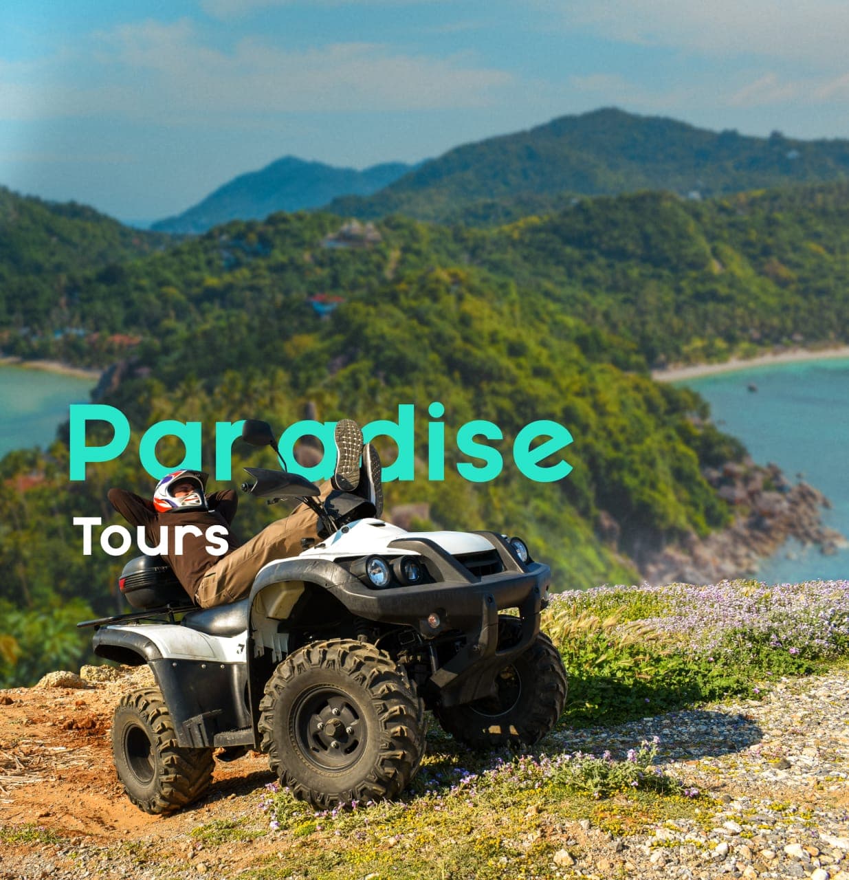
Paradise Tours is a well-known excursion company in Samaná, Dominican Republic. It takes visitors to the region's untouched beaches and deep into the island on quad tours, uncovering the corners the average tourist never gets to see.
The operation worked. The brand didn't. Without a defined visual identity, it was hard to stand out in a market where everyone sells the same thing: sun, sand and adventure.
They came to us to solve it. The brief was to build their brand from the ground up — an identity that captured the spirit of their excursions and, above all, set Paradise Tours apart from the rest.
The challenge
Adventure and credibility, in a single brand
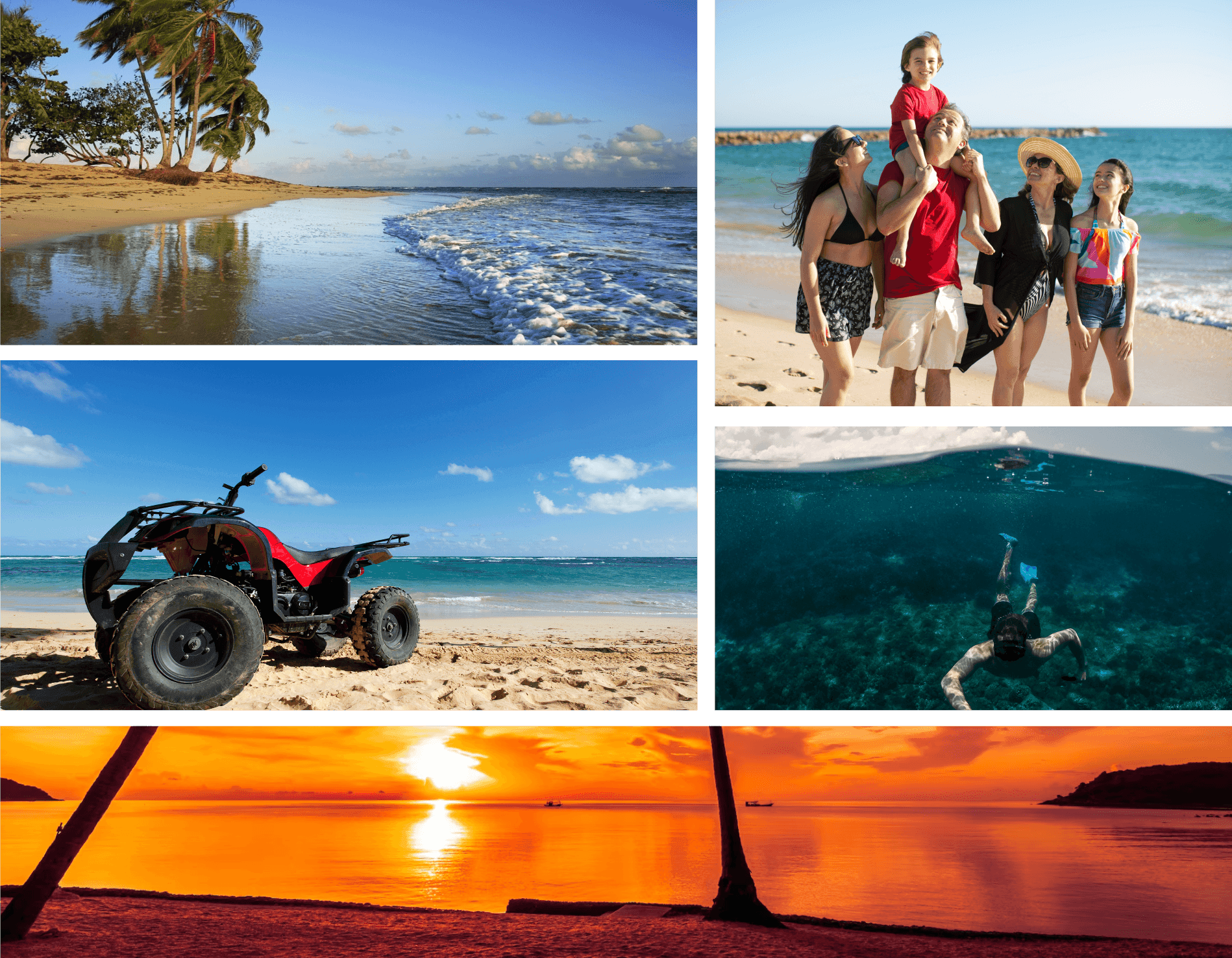
The challenge: an identity that conveyed adventure and relaxation at once, with the tropical charm of the Caribbean. It had to instantly evoke everything the company offers — from an afternoon on the beach to a quad excursion across the island.
And it had to do so without losing its composure. That was the hard part: balancing the promise of fun with the reputation of a serious, dependable company. The result had to capture, unmistakably, the spirit of Paradise Tours.
Brand · Logo design
From vision to brand
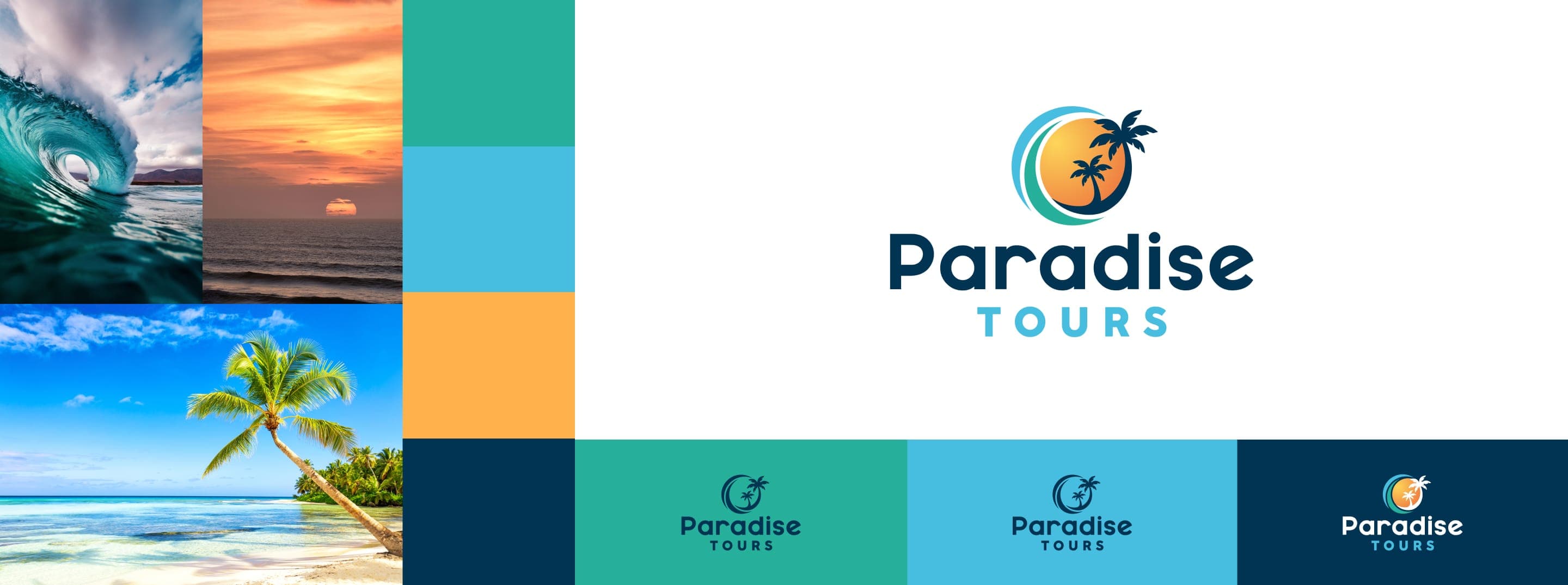
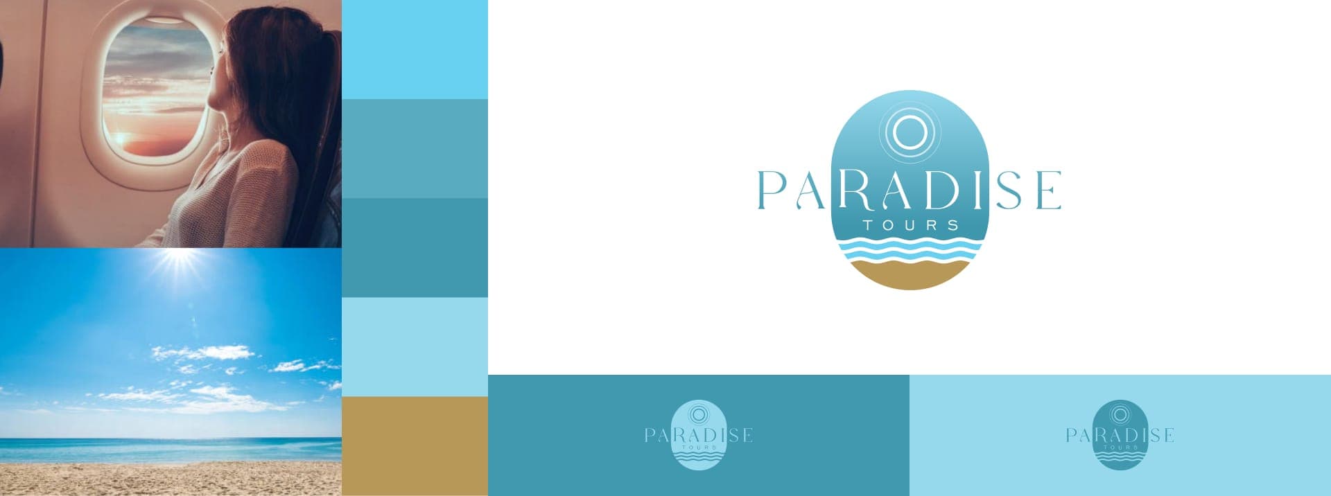
We started with the client's vision and brought it to life. The challenge was finding the exact interpretation — the one that captured the essence of every excursion in an image that felt fresh and worked hard. We collaborated closely, tested combinations, refined them. The final logo reflects that original vision and promises, at first glance, an experience you don't forget.
Proposal No. 1
Proposal No. 2
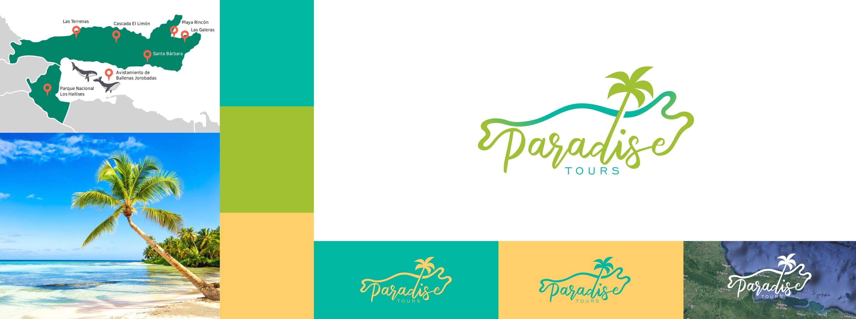
Proposal No. 3
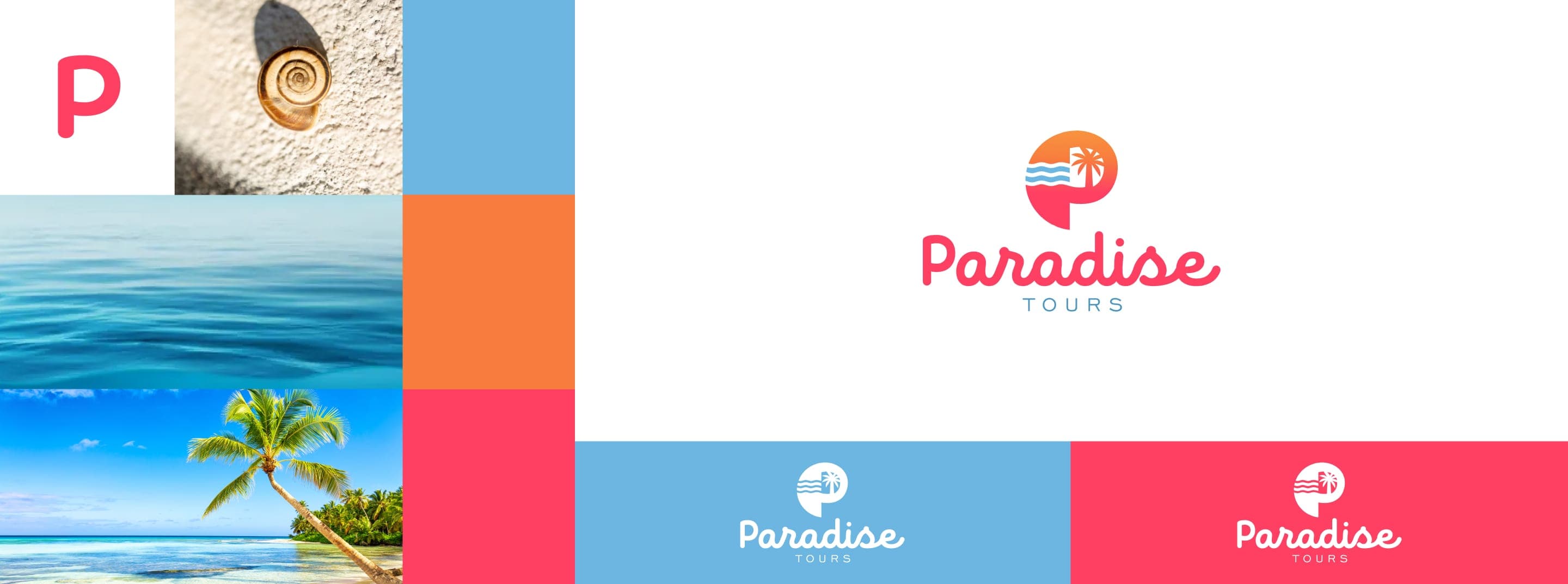
Proposal No. 4
Logo selection
The essence of Samaná
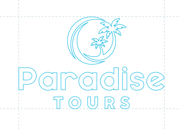
The client chose the proposal that best captures the identity of the brand. It is a symbol built from the elements that define Samaná: the region's leaning palm trees, its sunsets, the rolling surf and the deep green of the trails the ATVs run.
In a single mark, both sides of the brand come together — the natural beauty of Samaná and the adventure it promises.
Typography selection
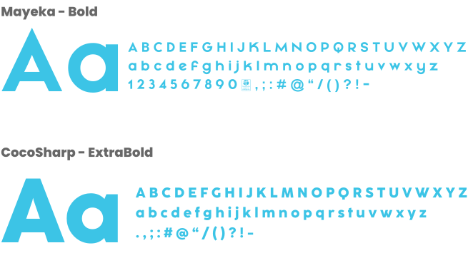
MAYEKA and CocoSharp
Typography carries a large share of the identity: it communicates the message before a single word is read. We chose MAYEKA and CocoSharp, two closely related typefaces that convey both the tangible and the intangible sides of the brand. Both read clearly even at small sizes, without taking any force away from the content.
Color selection
Orange, blue and green
Orange, blue and green. Orange brings warmth and adventure; blue, the calm of the sea and the sky; green, the abundance of nature. Together, in three tones, they sum up the beach experience the brand delivers.

Brand
Texture
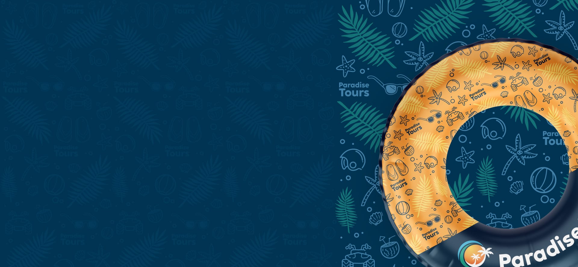
Texture is a key piece of the identity. We built one that gathers everything you feel on a day at the beach: the grain of the sand, the roll of the waves, the pattern of the palm leaves. At a glance it communicates what the brand promises — rest and energy by the sea — and sets just the right mood for someone who isn't a customer yet.
A texture of its own sets Paradise Tours apart from the competition, makes it more memorable and gives it a coherent visual language on any surface. Wherever it appears, you know it.
Brand
Tagline
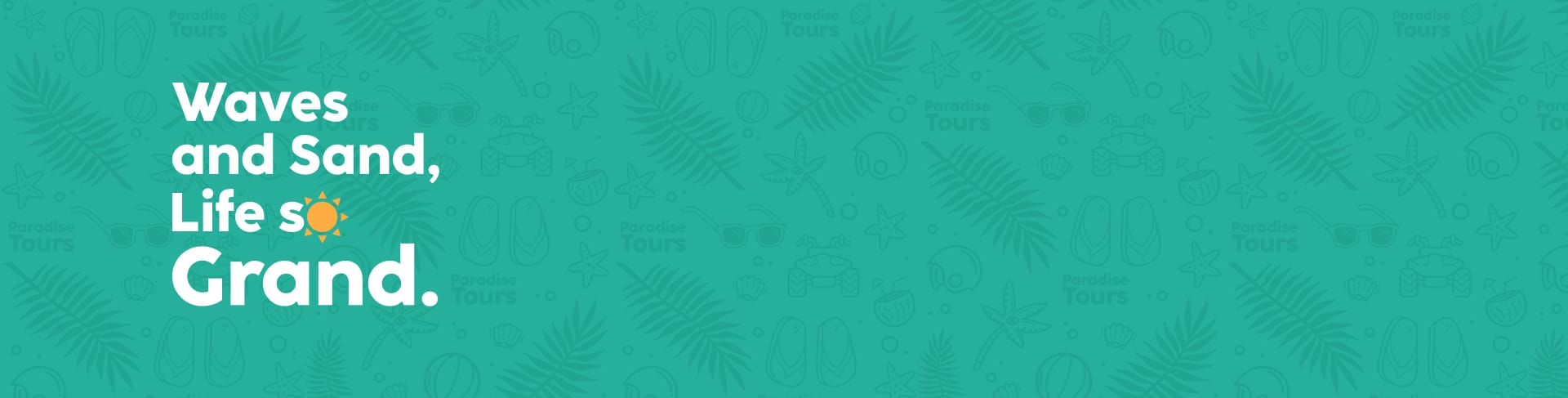
For the slogan, we distilled the essence of the brand into a phrase that sticks. The goal was for the reader to associate the brand with a relaxed, joyful way of living — the mindset of someone who travels to disconnect.
The wording forms a simple rhyme that is easy to remember. Whoever reads it or hears it carries a piece of the brand with them.
Brand
Brand book
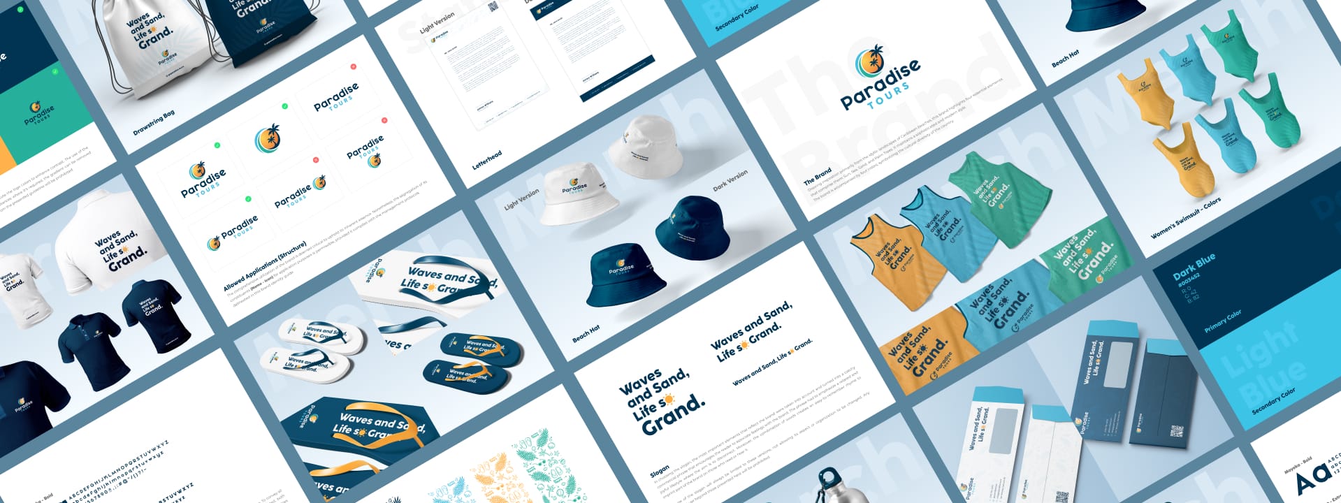
The brand book brings everything together in one place: mission, vision, values, color palette, typography, imagery and voice. It is the guide that sets the rules — clear and consistent — for how Paradise Tours should be represented on any medium.
With it, the brand stays consistent, becomes easier to recognize, and every communication speaks with one spirit.
Brand book
Stationery
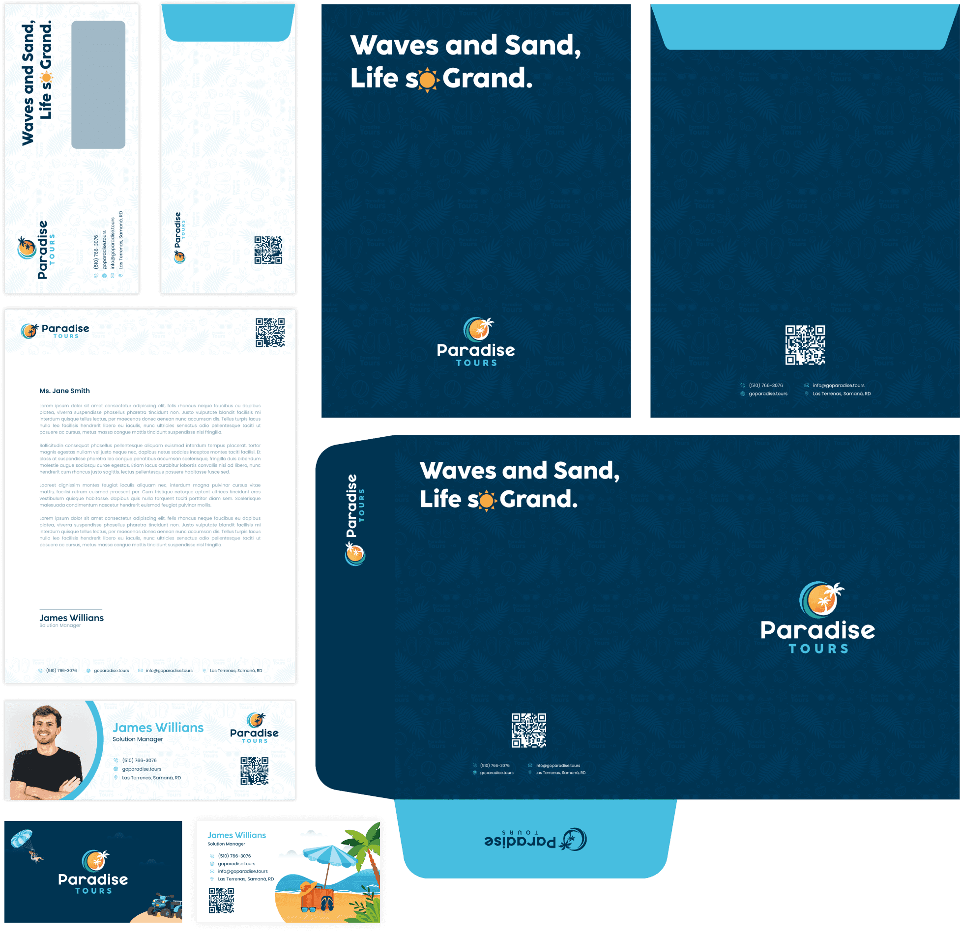
The brand book covers the full stationery suite, so every touchpoint speaks the same language. Envelopes, letterhead, business cards, promotional material — all of it follows one visual system and reflects the essence of the brand.
The vivid colors and beach-inspired graphics repeat the same message every time: a vacation you don't forget. In every interaction, the customer meets a clear, coherent brand — and recognizes it instantly.
Brand book
Merchandise
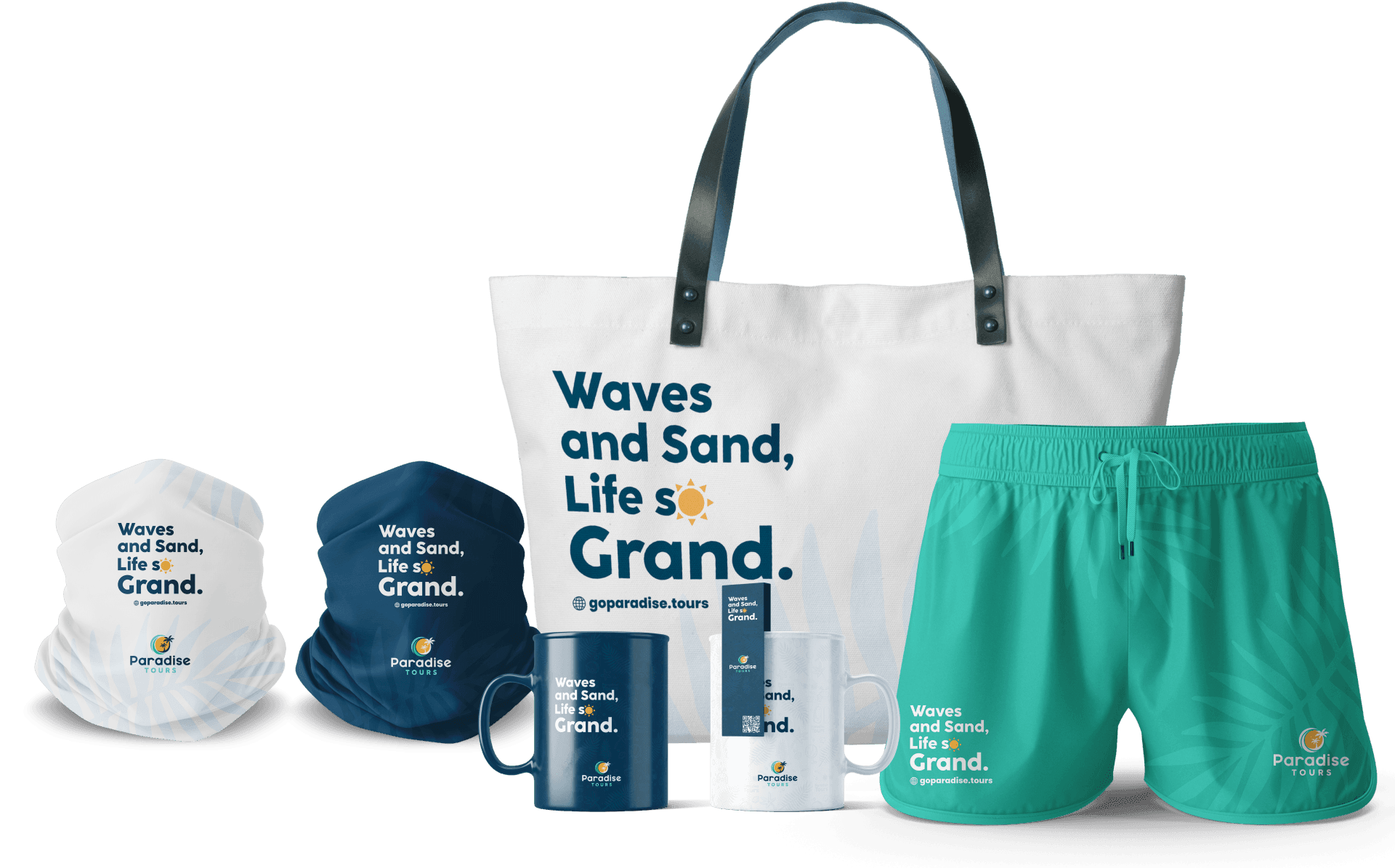
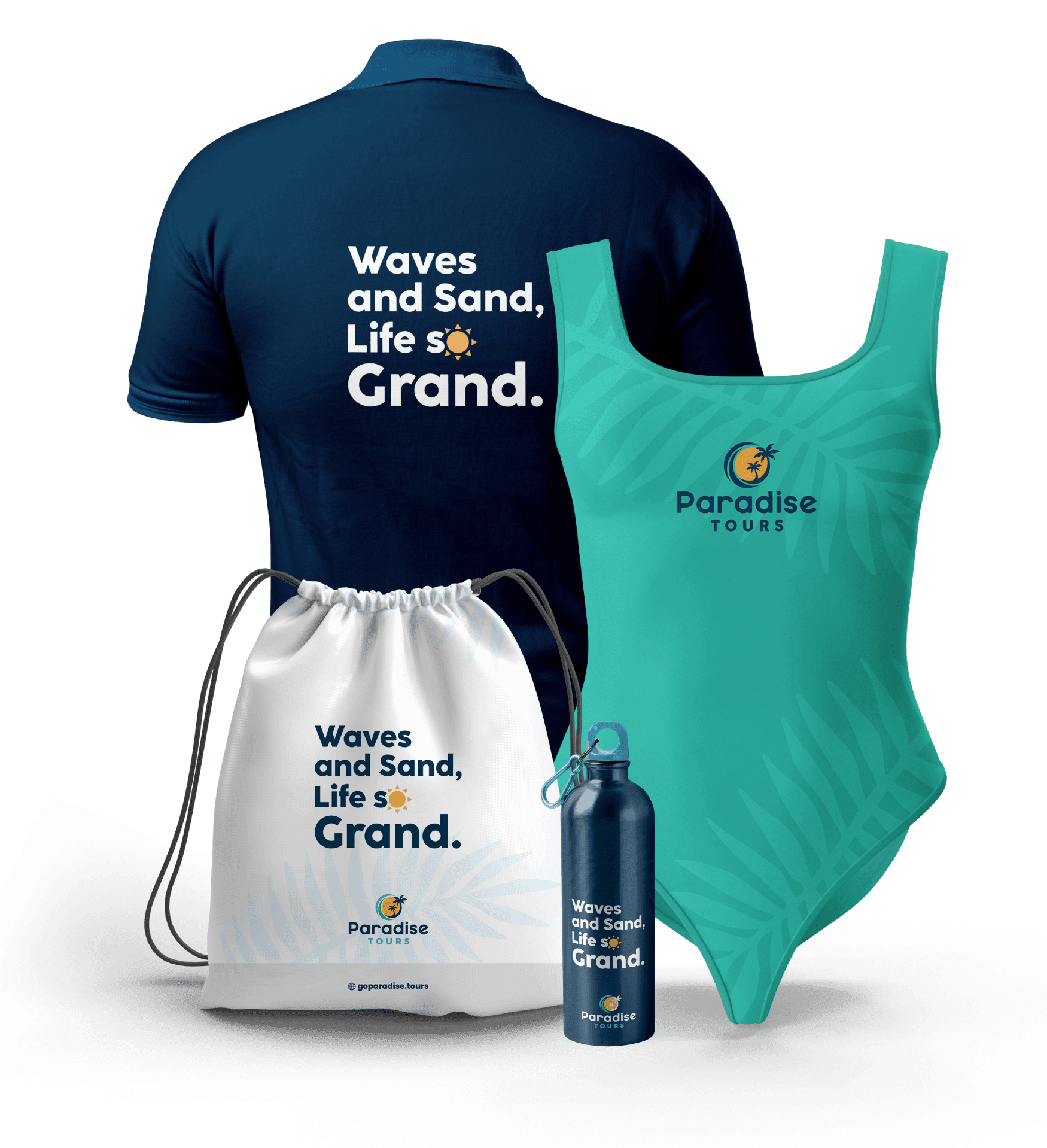
Every piece of merchandise — t-shirts, caps, mugs — becomes physical proof of the brand's promise: beach vacations that stay with you. With vivid colors and Caribbean-inspired graphics, each item reinforces the identity and its central message.
Whatever the product, the customer stays connected to the same experience. That consistency strengthens the brand and brings it closer to the people who wear it.
Excursions to paradise
Project results
The result exceeded expectations. The identity we built fits exactly what the brand needed — it reflects its values and its essence without forcing a thing. The client was more than satisfied.
Above all, the brand did its job: catching the public's eye and staying in its memory. Today it is instantly associated with the joy and calm of a Caribbean vacation. The project didn't just cement the identity of Paradise Tours; it planted it in the mind of everyone who sees it.
Let's build your brand and put it to work.
Design, engineering and artificial intelligence, in service of your next project.