Before a customer reads a single word of yours, they have already formed an opinion. Type is the first thing the eye processes, and it carries a message of its own: a brand can read serious, modern, expensive or cheap depending on the letters it picks. That is not decoration. It is your business speaking without saying anything. Here is how it works, and how not to get it wrong.
Why letters communicate more than the words they spell
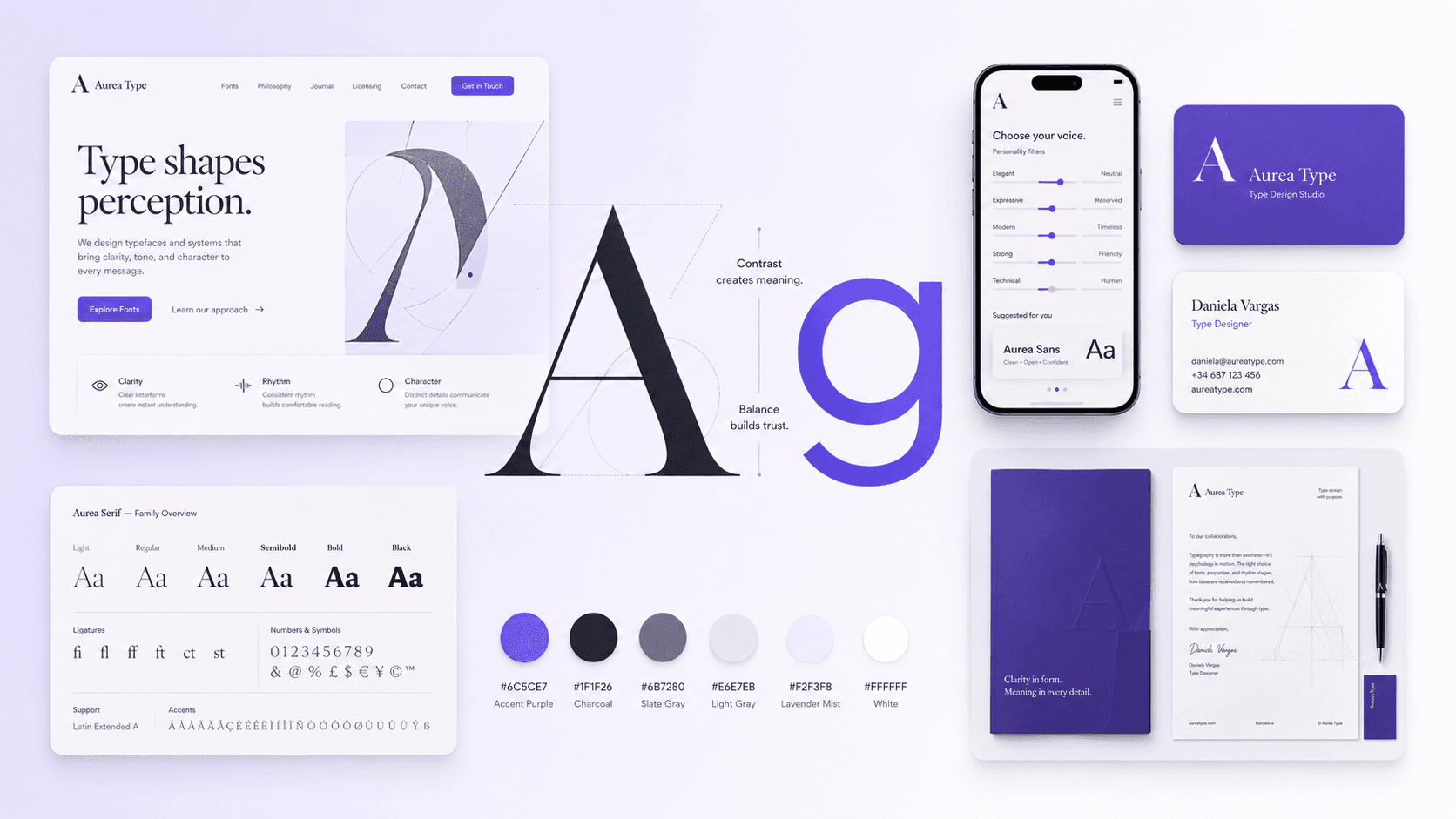
Type triggers learned associations. A serif — a letterform with those small finishing strokes — reads as tradition, authority and prestige, which is why law firms, banks and any brand selling trust reach for it. A clean sans serif reads modern, direct and technical, which is why digital products and businesses that want to look quick prefer it. Your customer never analyzes this consciously, but they feel it. And the feeling arrives before the argument does.
Weight and size are talking too
Beyond the typeface itself, weight and size direct the eye and set hierarchy. A big, bold word commands attention: that is what headlines and the button you want people to press are for. Lighter, smaller text reads as detail and refinement. When everything shouts, nothing gets read; when everything whispers, nothing sells. The balance between what stands out and what supports it is what lets a page be understood at a glance.
What almost nobody tells you: the right font depends on who you sell to
There is no "good" typeface in the abstract. There is the right typeface for your business and your customer:
- If you sell trust and experience (legal, healthcare, finance), a restrained serif communicates solidity without saying a word.
- If you sell warmth or freshness (food, beauty, consumer goods), a rounded sans serif or a face with some character pulls the brand closer.
- If you sell a digital product or technology, a precise sans serif signals that the business is current.
- If it has to live on a screen — and most of your traffic arrives on a phone — the type has to stay clean at small sizes, not just look good blown up on a wall.
Consistency: one brand, one system
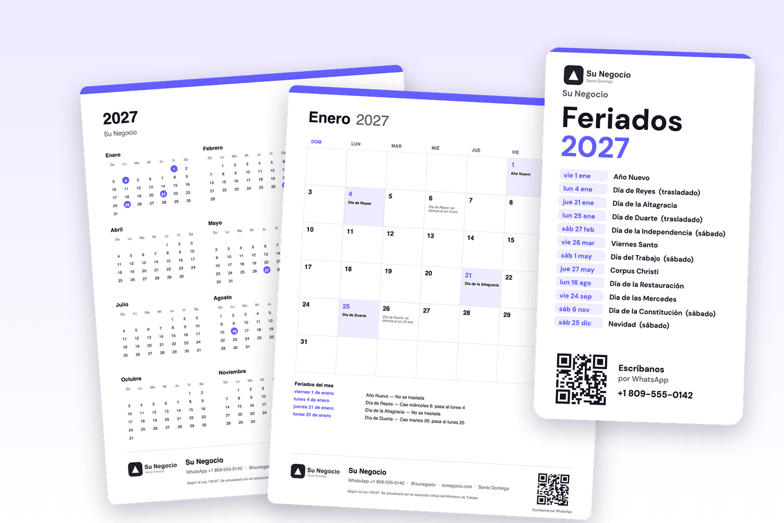
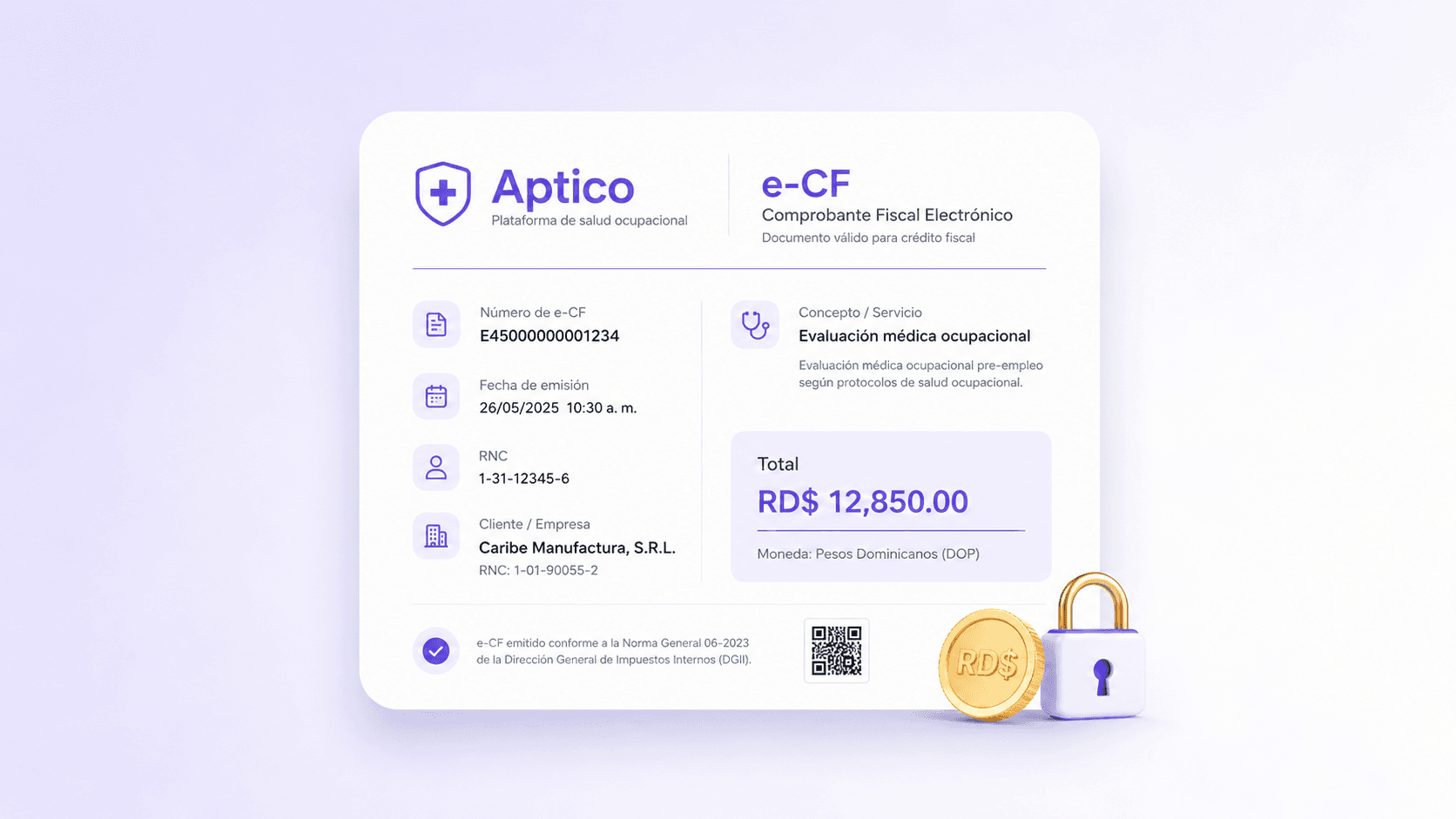
The most common mistake is not picking the wrong font. It is using five. The type on your logo, your site, your invoices and your social posts should feel like it belongs to the same family. When every piece uses a different letterform, the customer reads disorder without being able to explain why. A solid identity settles on two or three faces, gives each one a clear job, and repeats them everywhere.
The short version
Type is your brand's first impression, and it works even when the customer never notices it. Chosen well, it aligns what you say with what the customer feels. Chosen badly, it contradicts your own message: a premium business that reads cheap has lost before it opened its mouth.
We build complete visual identities — type, color and the system behind them — so your brand says the right thing on every surface, from the logo to the storefront. If you want your brand to say what you are worth, build your project in minutes.
We do not just write about this. We build it and we run it.
Stores, integrations, websites and intelligence already in production. Serving North America and LATAM since 2008.